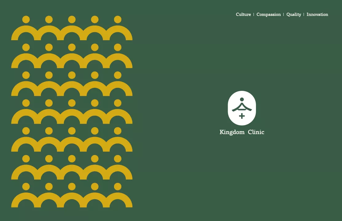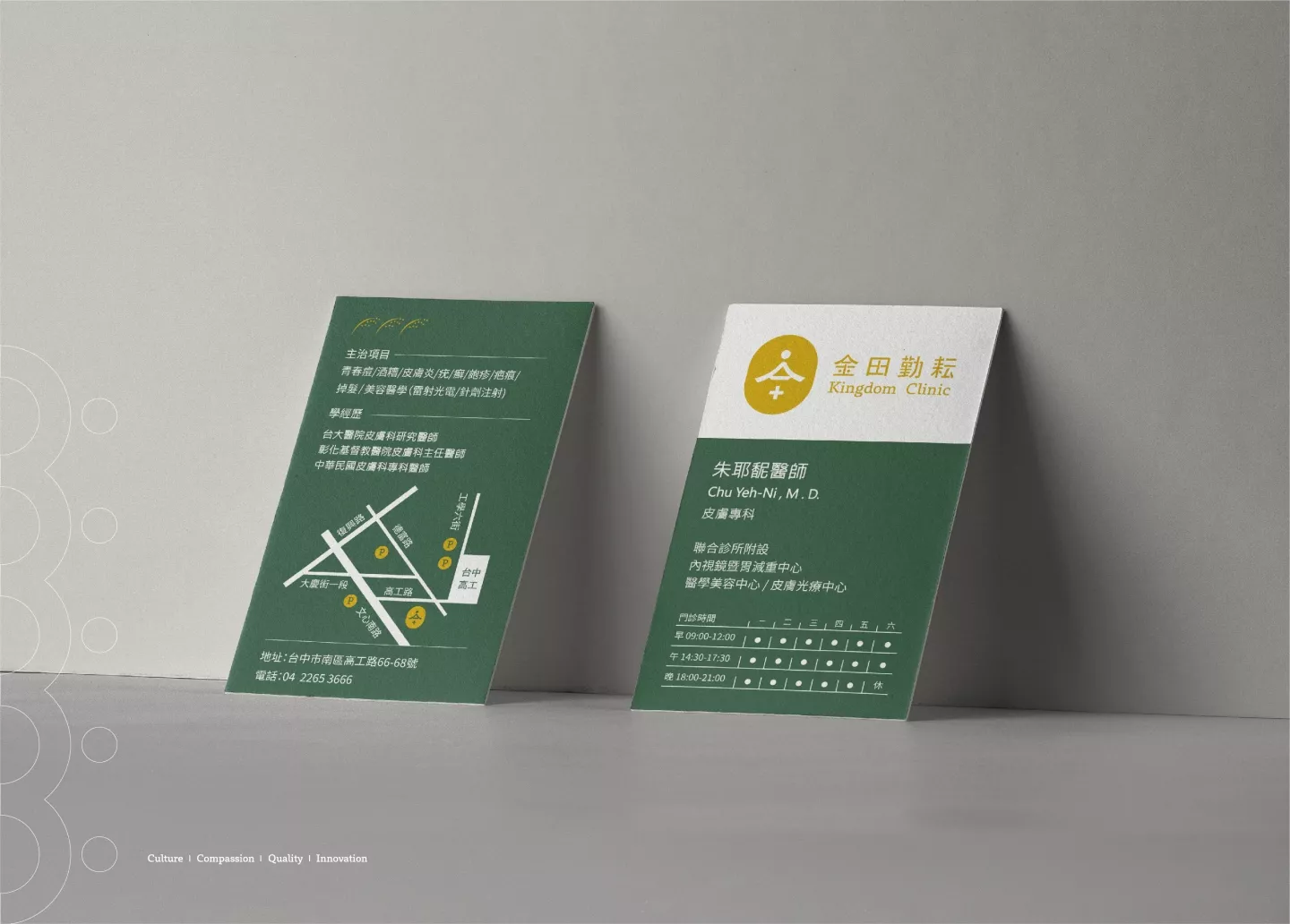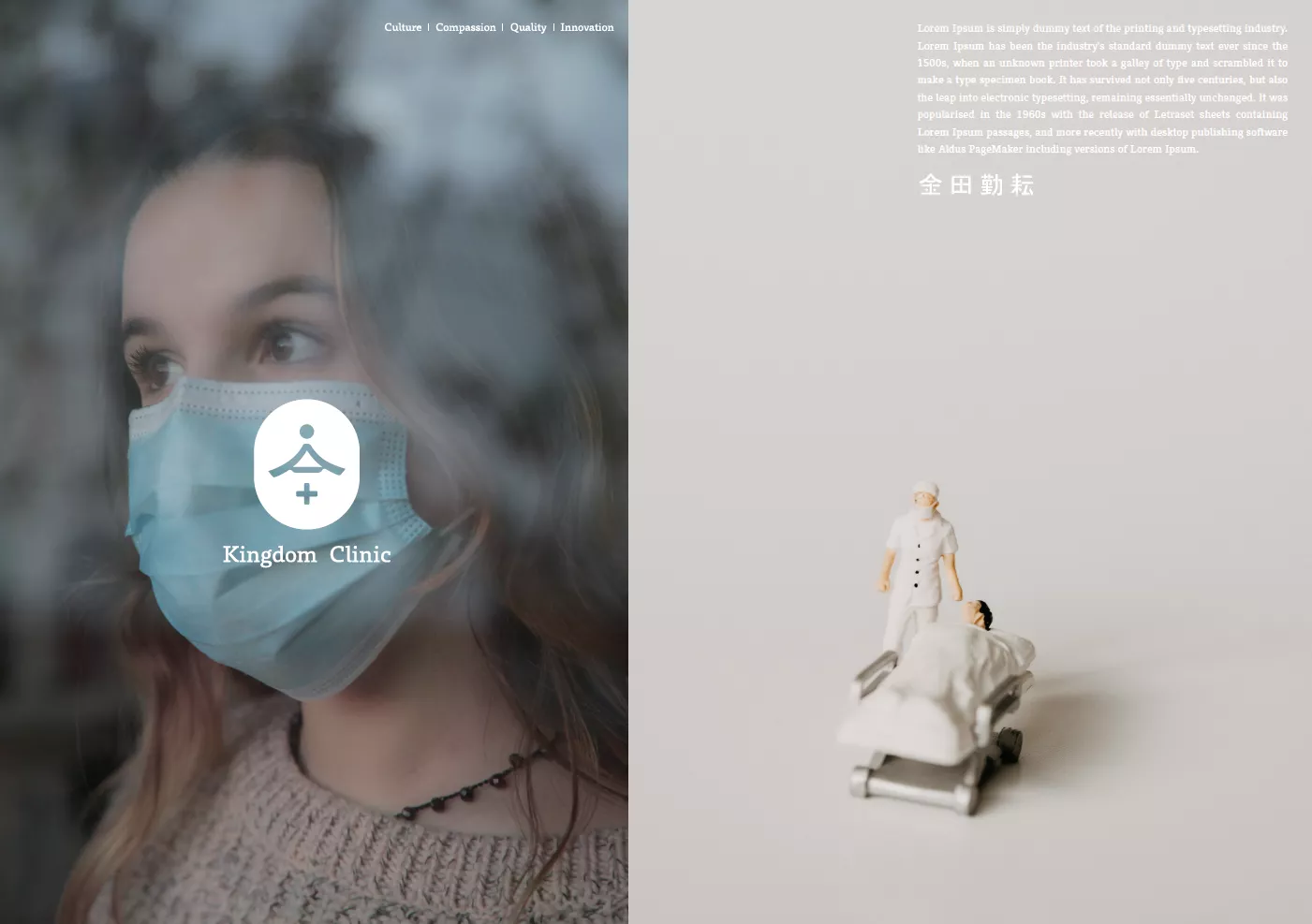
金田勤耘聯合診所
- 診所品牌識別設計|品牌故事|指標識別 | 網站設計
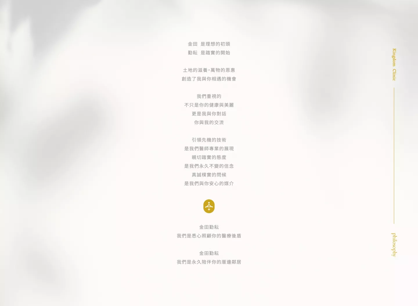
金田 是理想的初頭
勤耘 是踏實的開始
土地的滋養,萬物的恩惠 創造了我與你相遇的機會
我們重視的 不只是你的健康與美麗
更是我與你對話 你與我的交流
引領先機的技術 是我們醫師專業的展現
親切踏實的態度 是我們永久不變的信念
真誠樸實的問候 是我們與你安心的媒介
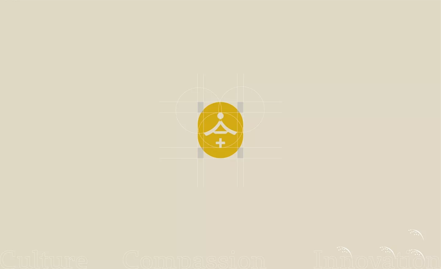
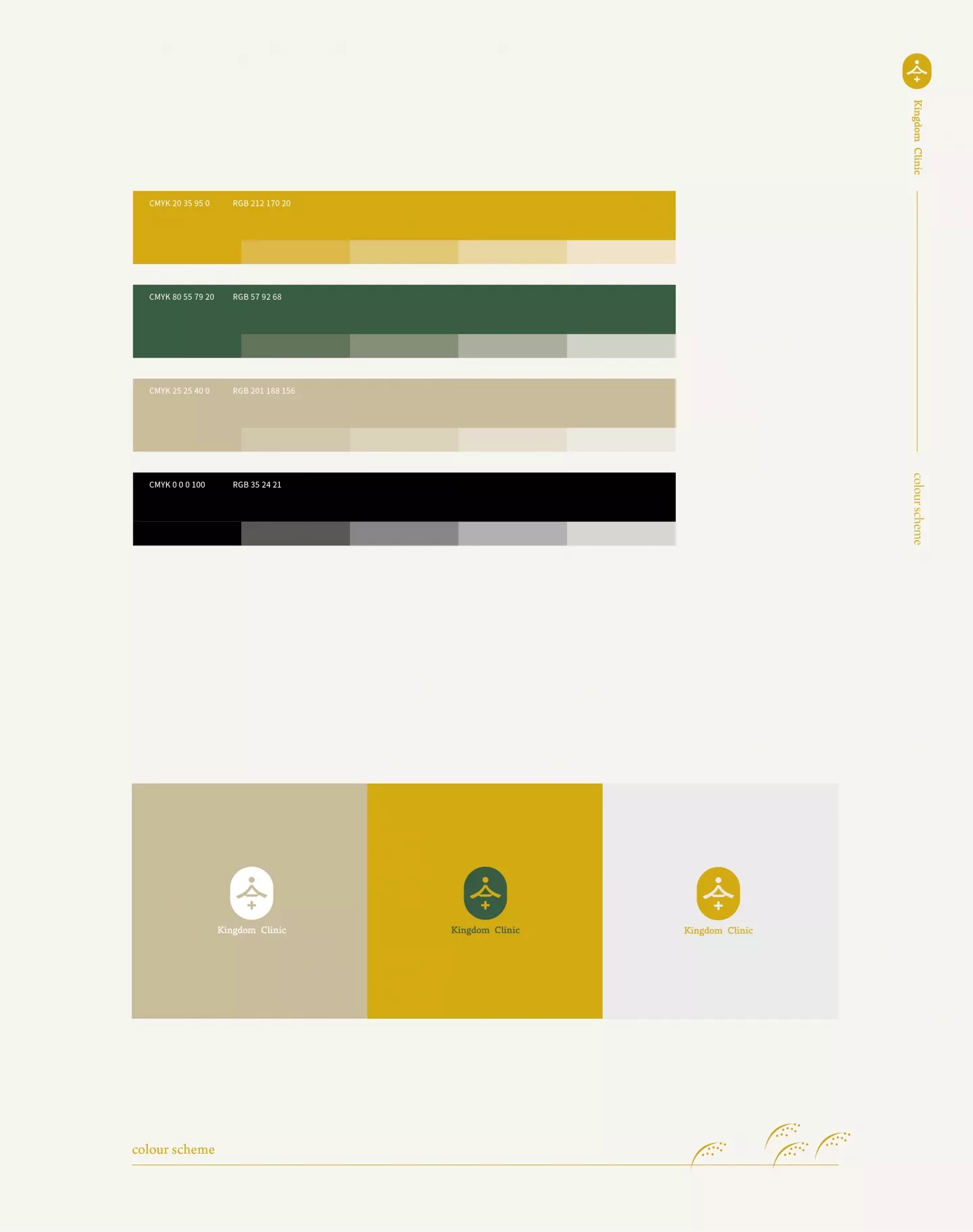
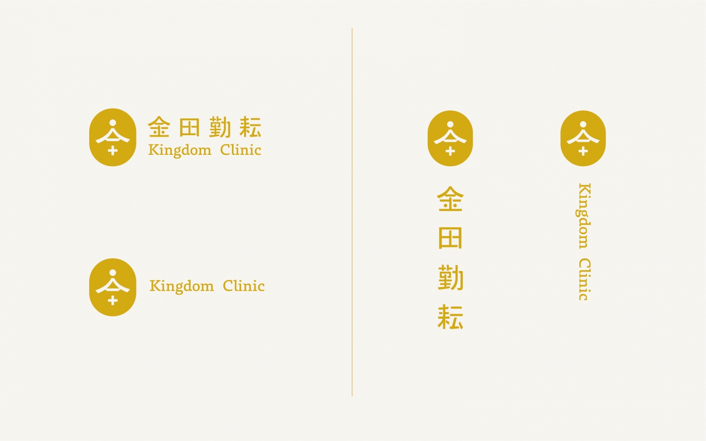
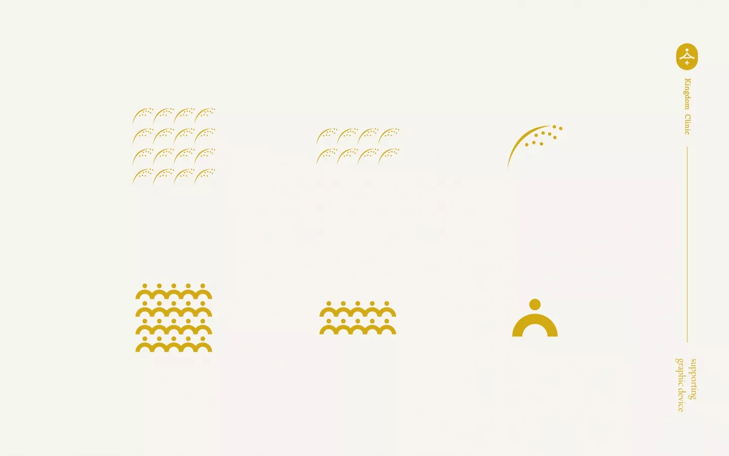
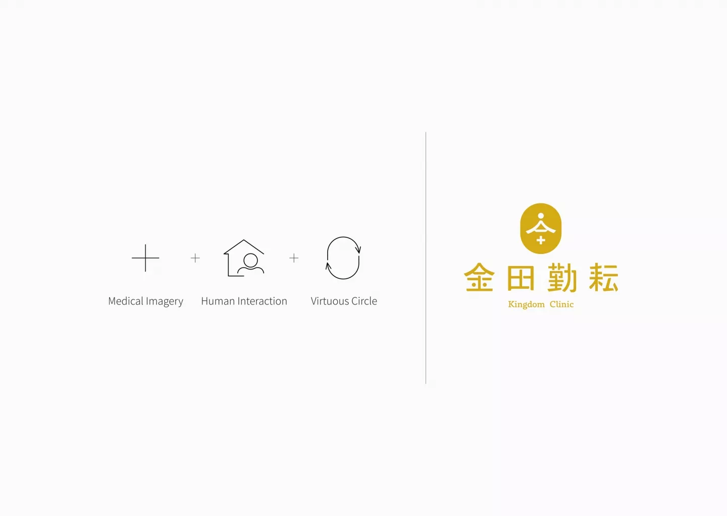
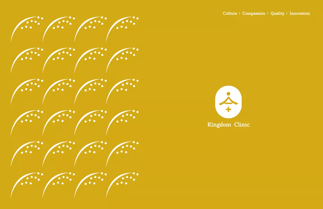
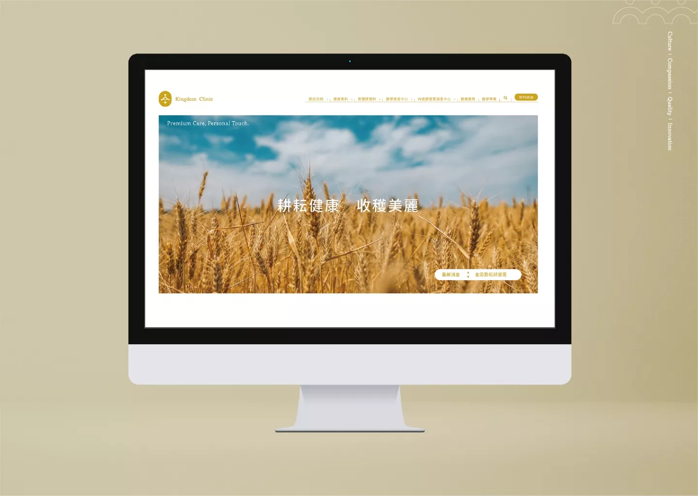
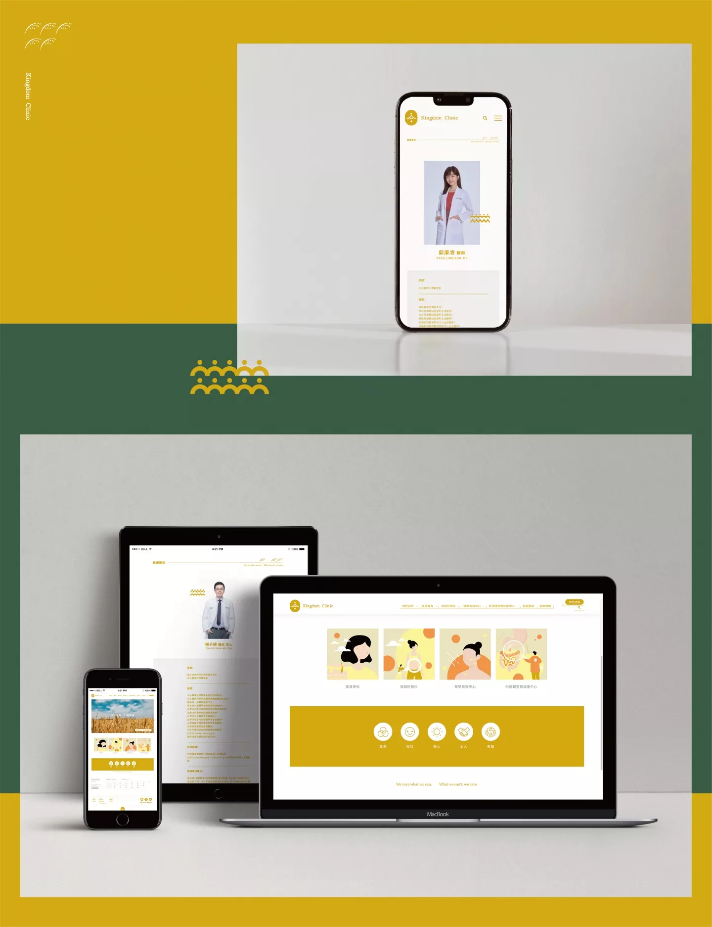
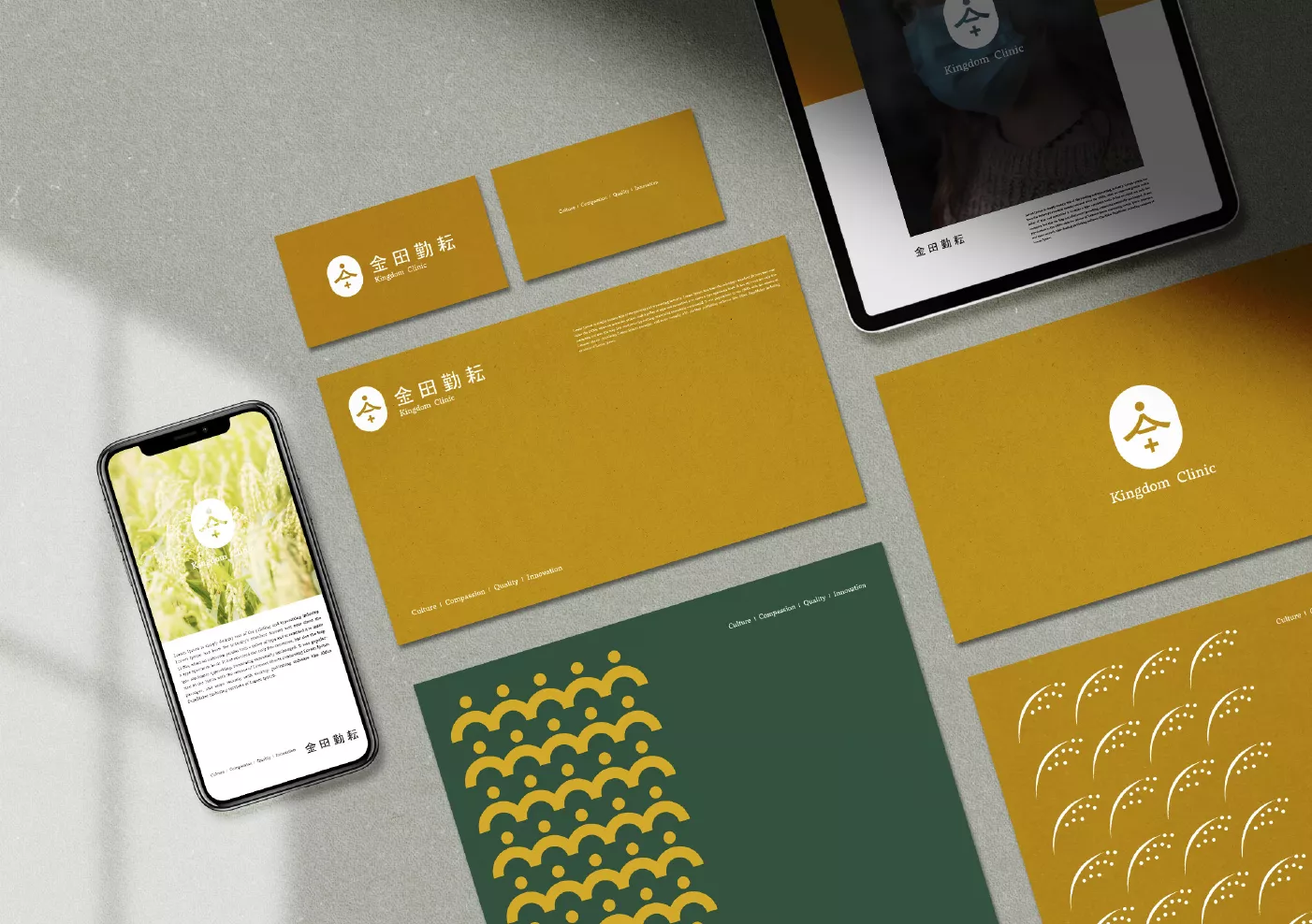
標準字體為非襯線之人文字風格,結合復古、穩重、溫度,為設計調整的主軸,帶入更多本土田野風格的輪廓,展現呼應品牌本質的人文精神。回歸人與人互動的初始狀態,貼近土地與人的情感變化並與之共生。 圖騰中運用家徽的風格融入醫療與人還有家的親切和氛圍,整體定位金田勤耘診所給予人的服務與內涵,同時也賦予品牌正向影響力,引領大眾感受台灣鄉村的親切與安心的體驗。
http://www.clinickingdom.com
402台中市南區高工路66號
04 2265 3666
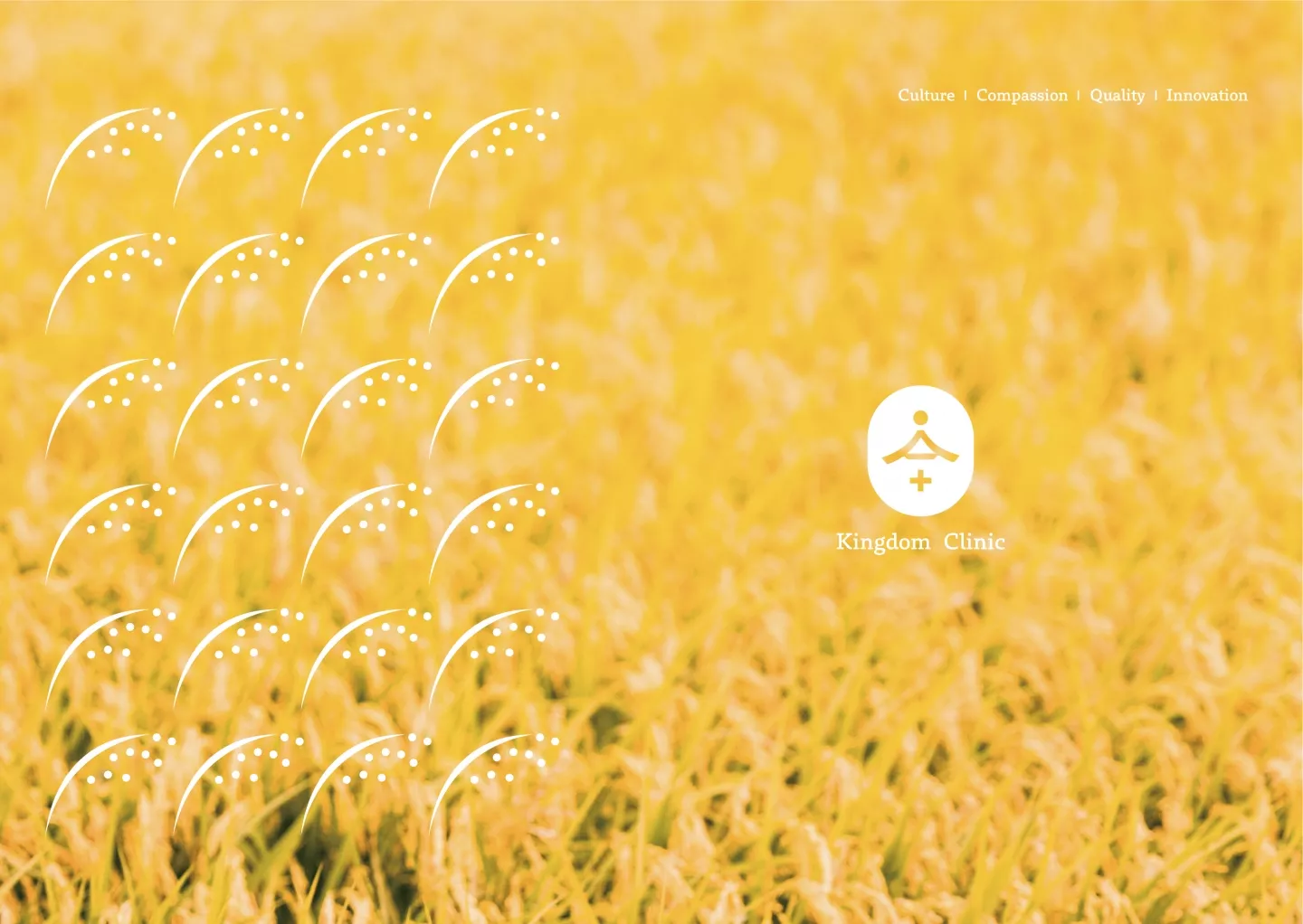
“金田” represents the beginning of ideals,”勤耘” symbolizes a steadfast start.
The nurturing of the land and the blessings of all living things have created the opportunity for our encounter.We value not only your health and beauty but also the communication and interaction between you and us.Leading-edge technology showcases the expertise of our physicians,A friendly and down-to-earth attitude embodies our unwavering belief,And sincere and unpretentious greetings serve as a bridge for your peace of mind.
The standard font style is non-serif, reflecting a blend of retro, stability, and warmth, tailored to echo the brand’s essence of human touch and rural charm.Returning to the initial state of human interaction, we embrace the emotions and changes of the land and people, forming a symbiotic connection.
Incorporating the style of a family crest in the symbol, we infuse medical care, human connection, and a homely atmosphere, positioning Kindom Clinic to provide services and essence that offer a positive influence, leading people to experience the warmth and reassurance of rural Taiwan.