詹絲蓉人文經絡
JenWen Meridian
- 人文經絡品牌識別系統設計 | 品牌應用設計
撥筋,是一種深層的按摩方式,沿著經脈以點、線、面,深入肌肉、筋膜,疏通運行受阻的氣血,達到放鬆身體的功效。
詹絲蓉人文經脈因家人健康問題而接觸撥筋,以按摩的方法調養體質,使身體重新回到健康的狀態,在匆忙的生活中,累積的疲勞使得身體沉重不已,撥筋循著身體的脈絡,輔以工具按摩,放鬆肌肉,重新疏通氣血,回歸自然狀態,不僅是恢復身體機能,深層按摩更滋潤著疲憊的心靈。
識別以撥筋畫「8」的基本手勢融入結合「絲」字的運筆之中,強調撥筋柔順的按摩手法,流線線條的粗細變化、圓角八角形外框巧妙地帶出了柔中帶剛的按摩力道。標準色以較低彩度的大地色系呼應著撥筋回歸身體本質的特色。
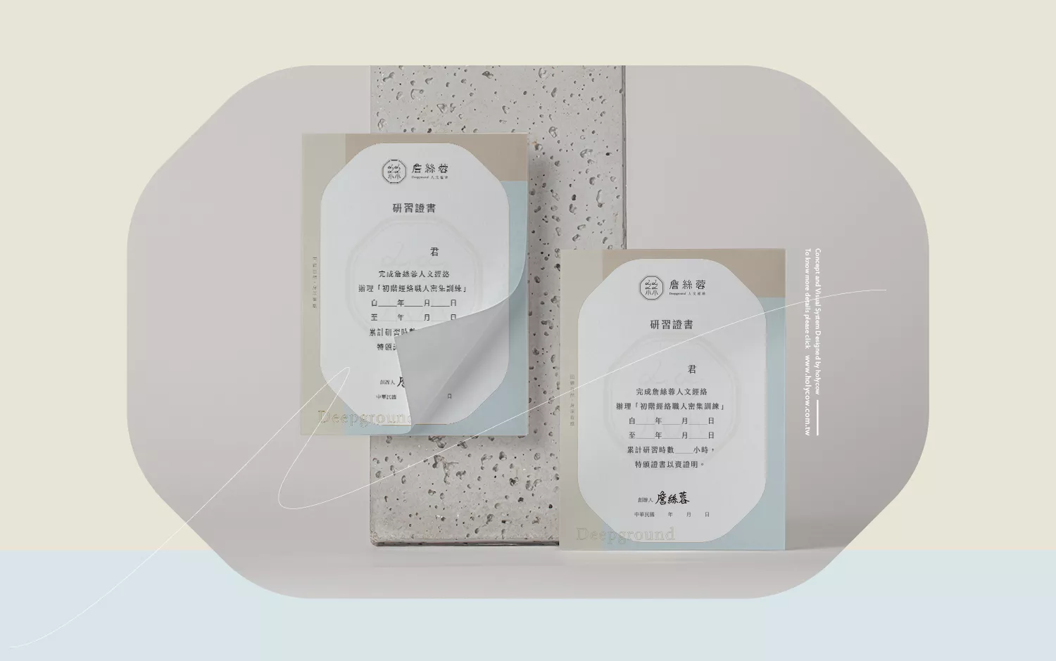
事務用品部分則依循識別設計,輕柔的線條與色彩相互配合,整體視覺舒適、放鬆,與品牌放鬆身心的理念不謀而合。
Tuina, a form of deep tissue massage, involves applying pressure along the meridians to penetrate the muscles and fascia, unblocking the stagnation of qi and blood, and achieving the effect of relaxing the body.
Jancy Jung, the founder of “人文經脈” (JenWen Meridian), became acquainted with Tuina due to family health issues. Through massage, she nurtured her physical health and restored her body to a state of well-being. In the hustle and bustle of life, accumulated fatigue weighs heavily on the body. Tuina follows the body’s meridians, supplemented by tools for massage, to relax the muscles, clear the qi and blood pathways, and return to a natural state. It not only restores bodily functions but also nourishes the exhausted soul.
The logo incorporates the basic gesture of Tuina, “8,” combined with the character “絲” (silk) to emphasize the smooth and gentle massage technique of Tuina. The varying thickness of flowing lines and the rounded octagonal frame skillfully represent the gentle yet forceful massage power. The standard color palette features low saturation earth tones, echoing the essence of Tuina in returning to the body’s nature.
The stationery design follows the identity concept, with soft lines and harmonious colors, creating a visual experience that is comfortable and relaxing, in line with the brand’s philosophy of relaxation and rejuvenation.


