雲嶺鮮雞
U need chicken
- 滴雞精品牌識別系統設計|禮盒設計丨品牌改造
來自雲林的領先土雞,從育種、飼養、電宰、加工層層控管,替消費者嚴格把關。擁有自家經營數十年的土雞飼養場,小雞階段就用心給予優質的飼料和生長環境,長久以來主打天然、健康、美味,是一個具備豐富飼養經驗、對品質嚴格堅持的在地品牌。近年來因品牌包裝行銷推廣上,面臨品牌識別過於複雜、難以靈活運用,及識別性不高的問題,希望重新詮釋品牌精神,重新設計優化logo。進而延伸設計,推行一款嶄新形象的品牌年節禮盒。
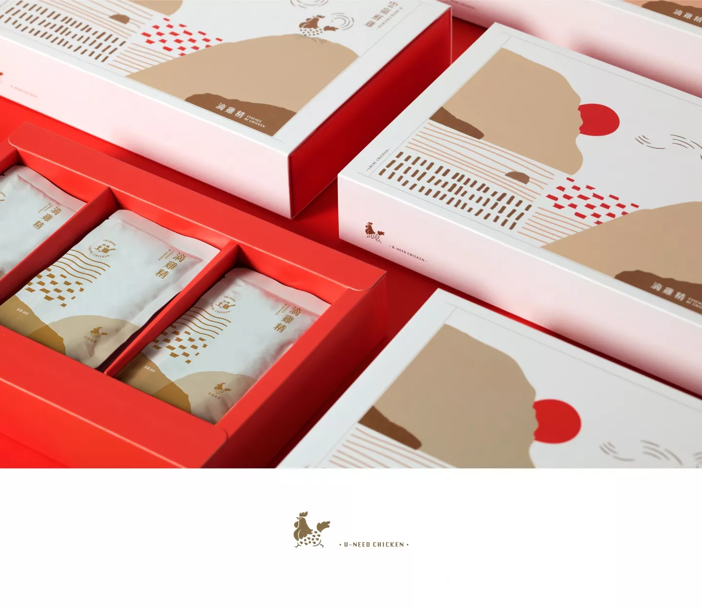
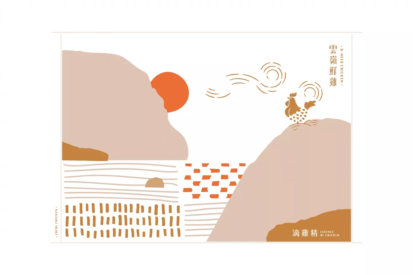
在logo設計發想上,排開原有繁複的山嶺和景色元素,以品牌堅持育種的紅羽土雞特徵為主軸,特別著墨勾勒出雞冠、雞尾、羽毛流線的特徵,讓識別簡化更彰顯品牌特色,羽毛的表現上融合滴滴純粹的語彙,傳達品牌主力產品——雞精的意涵,整體結合拓印手感的紋理,讓logo多了本土、質樸的溫度,標準字設計則以粗細有致的明體表現人文、偏手寫但不失專業穩重的設計主軸,字體局部巧妙融入雲朵、山嶺、雞腳的線條,呼應品牌價值,同時不流於格局太小、可愛或過於手感。土雞活力奔跑在山嶺雲霧之間的意象,如同徽章認證、又像在鍋內燉熬的設計意涵,則透過輔助線條的方式,讓品牌識別有了更活潑靈活的延伸應用。提升品牌形象和質感、卻不過於高貴有距離,保有鄉土在地意涵又不失贈禮喜氣的禮盒,是品牌識別優化後首推禮盒設計的主要訴求。設計構思以大塊面、幾何且不規則線條和色塊表現雲嶺場景,手撕邊線般的色塊處理,烘托在地鄉土的質樸,色塊有疏有密的構圖意境,透過象徵土雞和大地的暖色調搭配,讓整體視覺更增添細膩度。袖套的設計以燙金表現logo,提升禮盒的層次和質感,未來更可以因應不同節慶主題,改變袖套的設計樣式,讓禮盒在既有形象中有更豐富的變化性。
The organic chickens from Yunlin has been carefully monitored for high quality and safety for each and every consumer, from breeding, feeding, slaughtering, to processing. The organic chicken farm has been in operation for decades, and from the very beginning, the small chick is given dedicated attention with high-quality food and excellent living conditions. With a focus on natural, healthy and delicious food, this local brand is built upon a rich history of chicken breeding and a commitment to strict quality control. In recent years, there have been problems in the area of promotion for the brand. The brand image was too complicated, difficult to use, inflexible, and didn’t stand out. For that reason, we hope to reimagine the brand and redesign the logo and then extend that design to implement it into the New Year’s gift box.
For the creation of the logo design, we removed the original convoluted design elements, including the mountains and scenery, and focused rather on the brand’s competitive advantage, which is the red-feathered chicken. The design intentionally outlines the crest, the tail and the feathers to clearly highlight the brand features. The feathers are shaped in form of water drops to represent the brand’s core product: the chicken essence. Moreover, the design has a rubbing print texture to give the logo a more warm, humble, and rustic feel.The font design uses the Chinese Ming font to give a more folk feeling, as it has the appearance of being hand-written, while not losing its sense of professionalism. Additionally, the design ingeniously integrates into the font elements of the clouds, mountains, and chicken feet into its contour, echoing the inherent brand value without making the design feel too childish, careless, or amateurish.Auxiliary contour lines are used to create the imagery of the chicken as if running between the mountains and the clouds, while also giving the impression of a emblem as if a certification stamp, while also creating the suggestive image of the chicken stew in a pot, thus adding a greater vitality and flexibility to the overall brand image for further application.In this manner, enhancing the brand’s image and class, while at the same time not making it too distant from the consumer. Thus, achieving the goal of redesigning the brand recognition, which was to retain the indigenous and local feel of the brand, while still emphasizing the cheerfulness and joy of a gift box.The design concept uses geometric shapes, irregular line patterns and color blocks to comprise the local scenery. The outline edges of the color blocks are design to appear as if torn by hand, thus giving a more rustic feel to it. These blocks are dispersed, some in tight composition, some spread out, and in combination with warm colors symbolizing the chicken and the land, together they provide the final touch to the overall visual.The packaging sleeves are designed with a gold stamped logo to enhance the quality of the gift box. In the future, the design of the sleeves can be adjusted according to themes of particular festivals, giving the gift box variety in its design.


