大恆法律事務所
Infinity Law
- 律師事務所品牌識別系統設計 | 應用設計 | 網頁設計
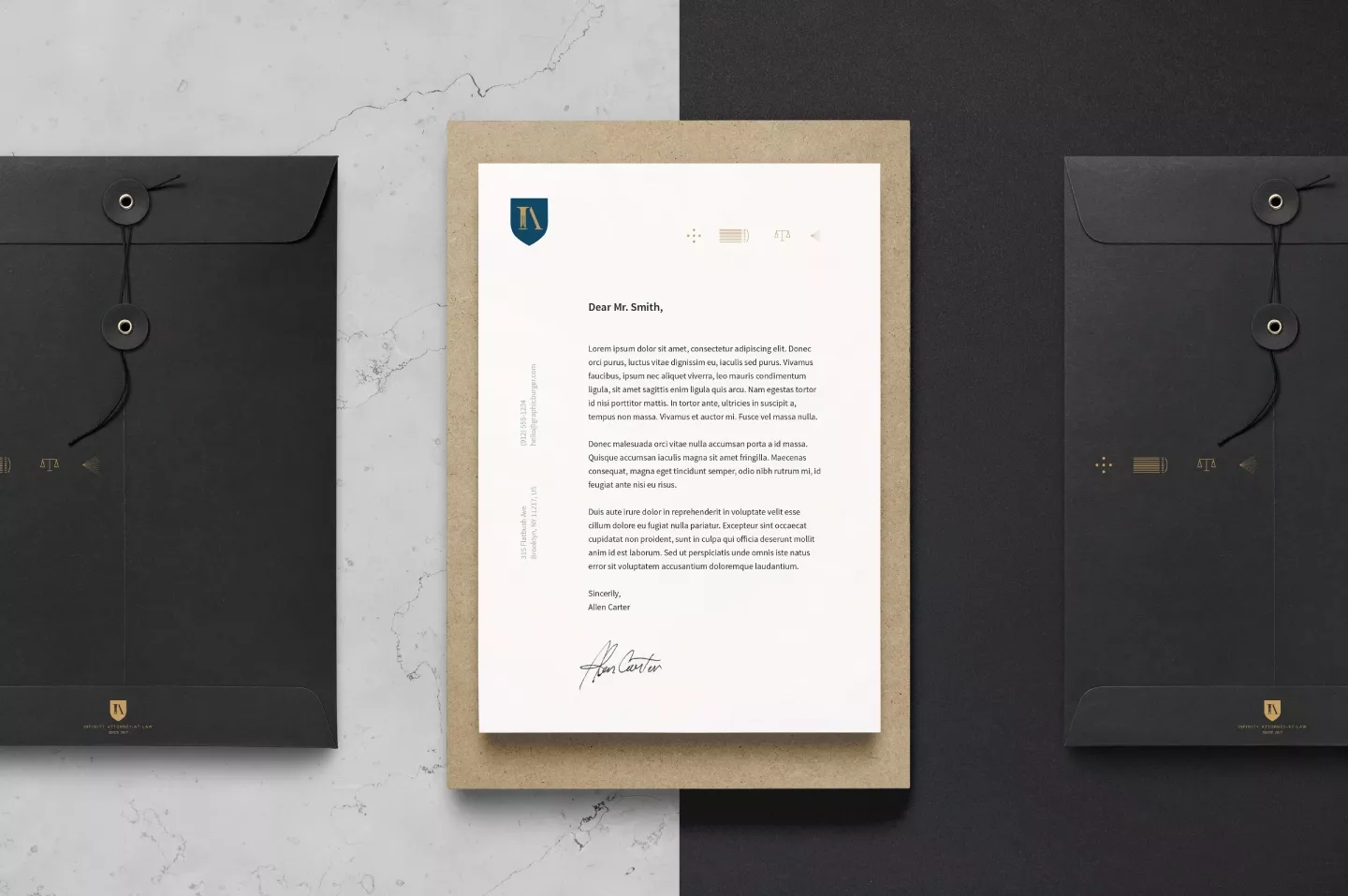
以神聖盾牌為主要的視覺基礎,融合品牌核心的I和A,象徵團隊永續經營,恆久堅立的公義精神,細心調校完美比例的歐文字體,傳遞出品牌卓越專業的服務特質,及細微入裡的剛柔兼具的法律技術,I的意象以細膩的線條表現法院裡的羅馬柱,象徵全方位專業的高度辯護能力和深厚的法學根基,正義盾牌的意象充分彰顯出堅實可靠,全力為企業,為客戶捍衛權益的使命與堅持。簡煉又沈穩的灰藍色調,融合雋永的金色,希望透過適切有差異化的設計,賦予視覺新的價值,而非只是視覺上華而不實的標新立異。
The holy shield serves as the main visual foundation and integrated with the core letters “I” and “A” of the brand, together they symbolize the team’s long-term commitment and long-standing spirit of justice. The fine-tuning of the proportion of the European characters conveys the brand’s outstanding professional quality service and its subtle interchange of rigid and flexible legal maneuvers. The letter “I” represent the high towering Roman columns inside the court, symbolizing the brand’s proficiency in legal defense and solid legal foundation. The image of the shield of justice demonstrates robust reliability, the passion and perseverance to defend the rights of the customer or the company. The calm grayish blue tone blends with the timeless gold color to create a distinctive visual perception of value, rather than just showy and flashy but without substance.


