完美國際Omni+ 山茶系列
- Behance精選
- 香港直銷品牌|山茶花洗沐品牌包裝設計
山茶系列代表著:生長(Grow)、修復(Repair)、活力(Energetic)、滋潤(Enrich)及天然(Natural),萃取山茶花精華,混合山茶籽油及茶皂素製成,具保濕、抗氧化的功效,從洗髮水到身體潤膚乳,提供全方位的身體呵護,滋潤每一天。
包裝設計
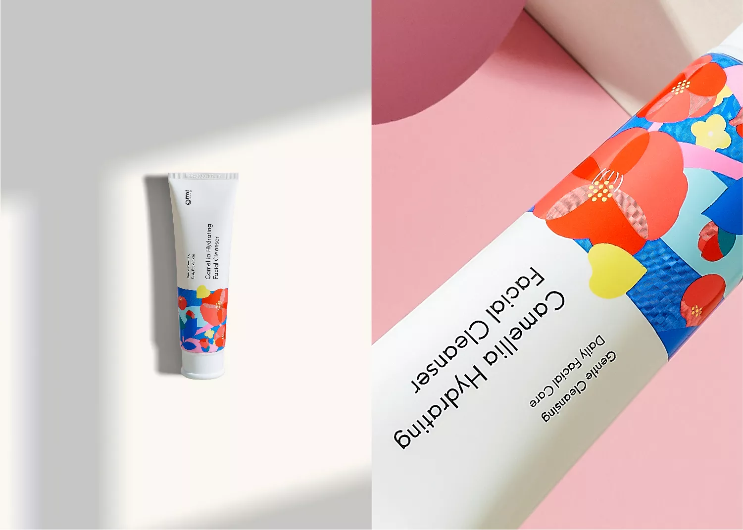
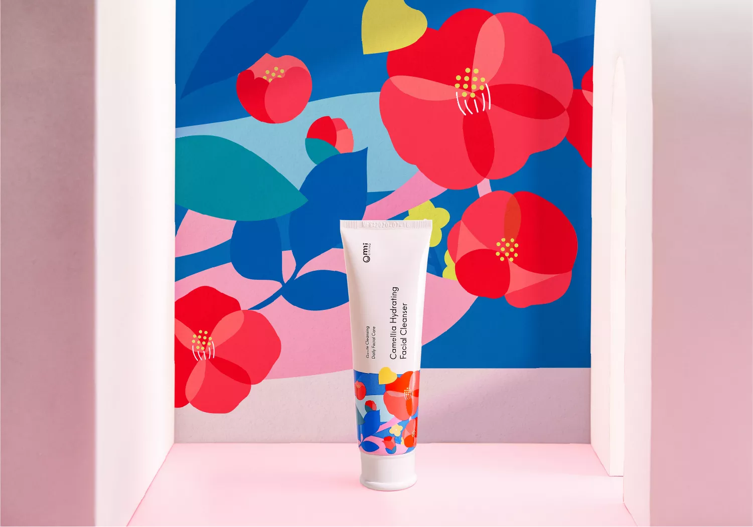
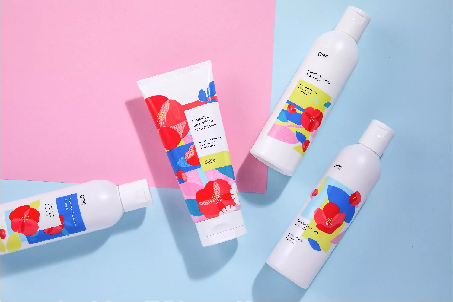
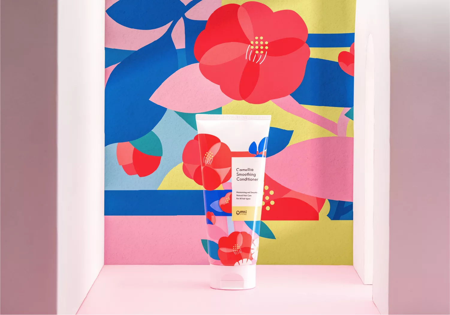
白色瓶身呈現山茶系列產品的清爽感,深淺不一的紅色構成山茶花主體,扁平化色塊透過堆疊的手法增加層次,豐富而不雜亂,在背景的藍、綠、黃色塊襯托下,更顯山茶花的嬌嫩欲滴,
高彩度的色塊恣意流動,象徵產品的水潤感,帶給使用者活潑鮮明的第一印象。
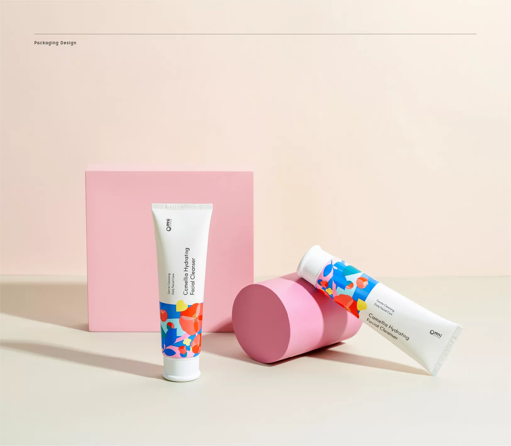
洗面乳、護髮素為軟管包裝,洗面乳包裝上半部留白,設計集中於下半部;而護髮素則以滿版圖案包覆。
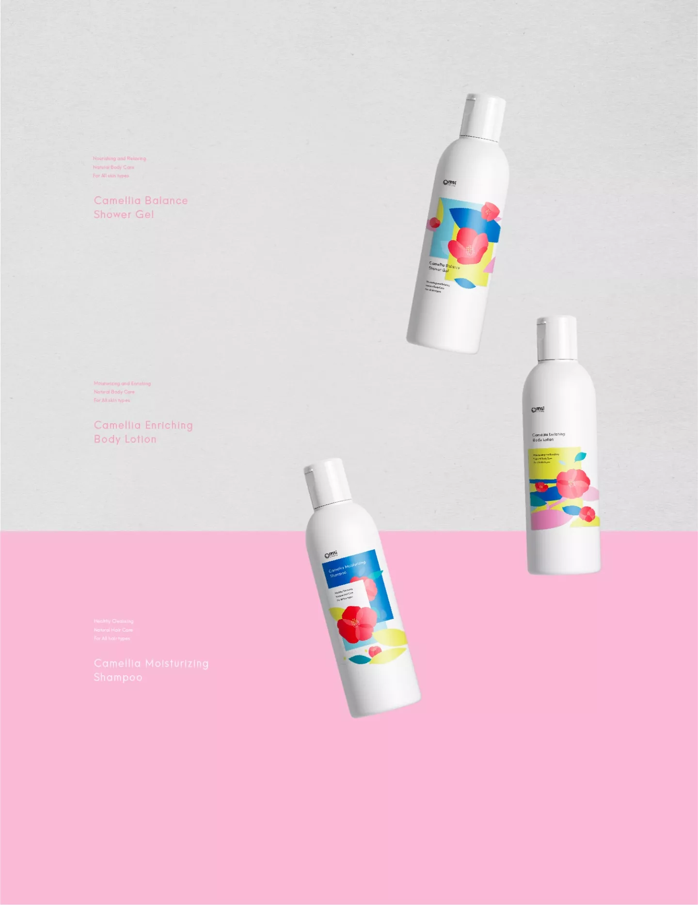
另外三款產品:洗髮乳、沐浴露及身體潤膚乳為罐裝,分別以深藍色、淺藍色及亮黃色作為背景,提高各品項辨識度。全系列產品一字排開,繽紛鮮豔的色彩令人目不暇給,又能輕易在其中找到需要的產品。
The Camellia product line represents “Grow”, “Repair”, “Energetic”, “Enrich” and “Natural”, using extracts from camellia essence mixed with camellia seed oil and tea saponins to create its moisturizing products with antioxidant properties. From shampoo to body lotions, the product line includes a range of products to care for the entire body.
Package Design
The white color scheme echoes the refreshing feeling from the Camellia product line. Each design is embedded with camellias with different shades of red. Furthermore, with the stacking of flat color blocks, the design creates a visual layering, copious but not messy. The blue, green and yellow color blocks in the background particularly accent the delicate and tender camellia.
The highly saturated color blocks flow freely, alluding to the moisturizing feeling of the product, giving the user a dynamic and vivid first impression.
The facial cleanser and conditioner are both packaged in a tube. For the facial cleanser, the design is concentrated only on the lower half of the package, while for the conditioner, the design pattern covers the entire package.
As for the other three products – the shampoo, shower gel and body lotion – they are package in bottles. Each with a different color – dark blue, light blue and bright yellow – to differentiate each product. When the whole product line is lined up together, the bright colors draw you in, yet at the same time, you can still easily distinguish between them.
