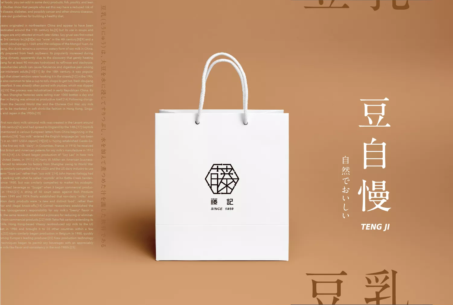
藤記豆花
Teng Ji Sweets
- 豆花連鎖品牌識別系統設計|品牌應用設計|空間規劃
藤記甜品-臻心不換,食不相瞞。豆花採用食品級非基改黃豆、不含消泡劑,臻食醇淬,嚴選每個好食材。
想像選物店融入藤記豆花的感覺,概念的轉換,替您精心挑選的豆子與食材,在藤記精密的的形象中提升至選物店的格調。
視覺上以工業硬派的意象風格為主要方向。以鐵管結合板手的概念,環繞著整體視覺圖示,象徵著良善的循環,以及精密的準則,再以工業鐵管組合出藤字的圖像,讓整體視覺表現出更完整的層次。
藤記字體設計中以簡約的筆畫與字體的黃金比例去排列組合,融合了圖騰的logo圖示,讓整體比例呈現完美組合,定義出品牌的專業與成熟定位。
Teng Ji Sweets – We won’t ever deceive you. Our tofu pudding utilizes food-grade organic soybeans, without any defoaming agents, every ingredient carefully selected to be part of the Teng Ji Sweets collection.
Imagine the shops having Teng Ji Tofu Pudding bring a shift, a change in perspective. Each bean and ingredient carefully selected just for you, so every store elevated to a higher level.
The brand imagery uses the rigid industrial design as its main focus.
The images of iron pipes and wrenches surround the overall visuals, symbolizing a quality cycle with precision at the core. Furthermore, using iron pipes to form the Chinese character “藤”, completing the visual imagery.
The Teng Ji font design uses a combination of simple strokes and the golden ratio of fonts, in unison with the logo, to present the perfect proportions, bringing out the competence and reputation of the brand.