天選
Natural choice
- 保健品品牌識別系統設計 | 禮盒設計 | 包裝設計
從肌膚保養到健康的維護。天選,給你最天然、最純粹的健康。
我們以沙棘作為產品的主要成分。沙棘生長在極惡劣的環境下,是具有高度經濟價值的植物,食用後容易吸收而滋補強身,漿果可直接食用。近年來,沙棘在世界各地廣受重視,被視為具發展潛力的藥用保健植物。
自然的成分使我們家產品有別於其他保健食品,可內服,可外用,這類果實不易取得,但我們一心只想陪伴你恢復健康。
保養品系列含有沙棘、蘆薈等多種珍貴成分,使皮膚保濕透亮、Q彈緊緻。保持肌膚的最佳性能,帶給肌膚最完善的修復。
For your personal daily joy and health.
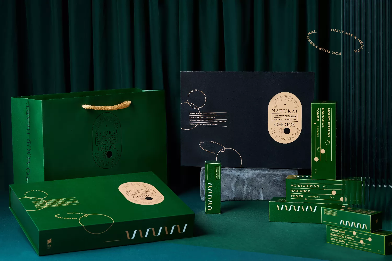
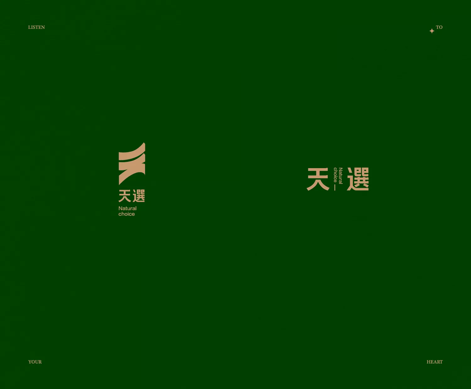
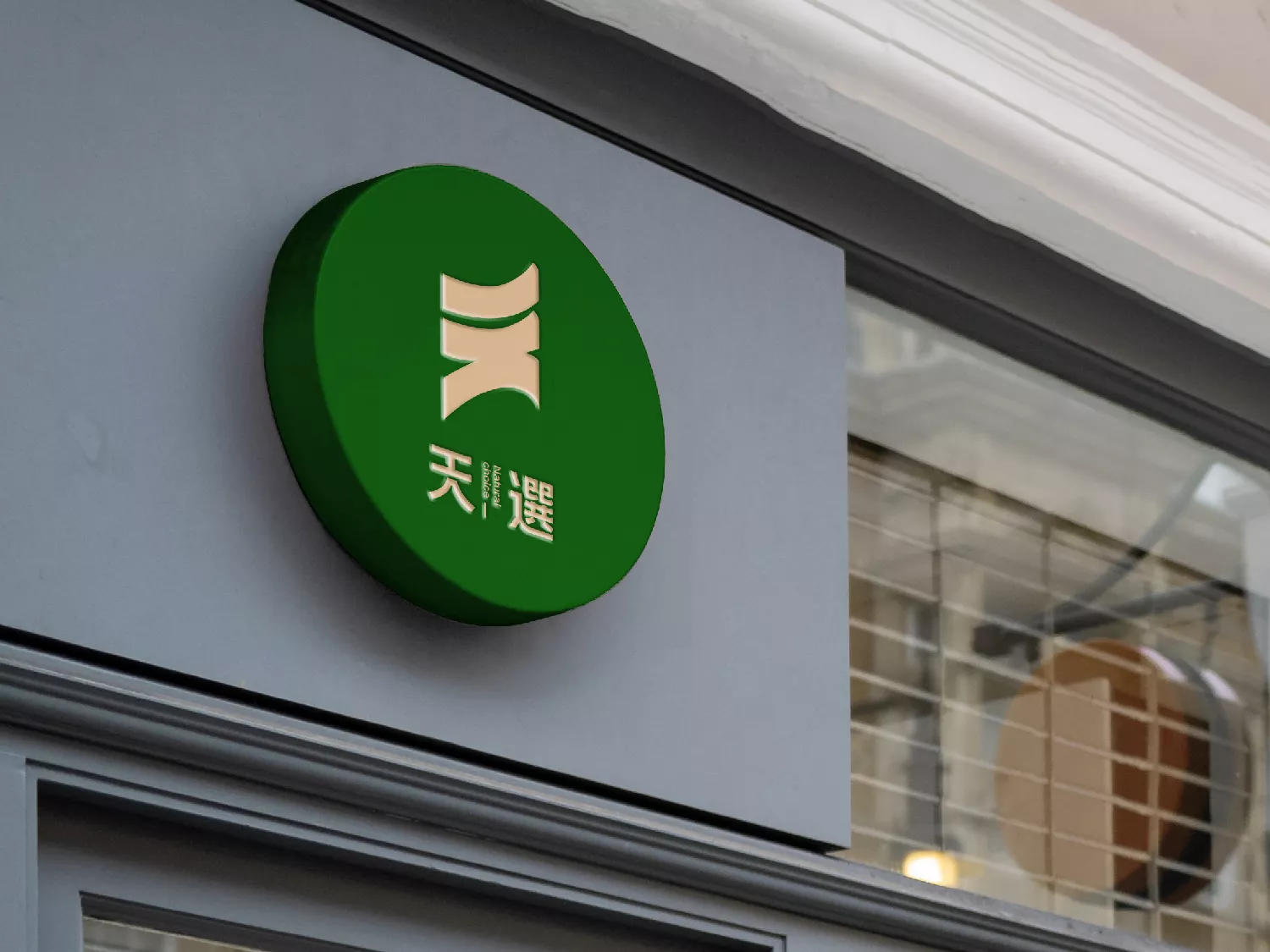
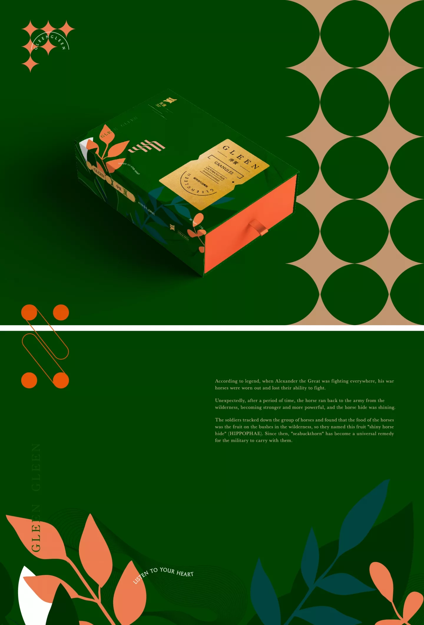
Logo設計採用「天」字融合跳躍的意象,呈現一種健康活潑的形象。顏色採用綠色為主,呼應品牌天然的成分;以金色為輔,帶出品牌想將產品禮盒化的精緻感。
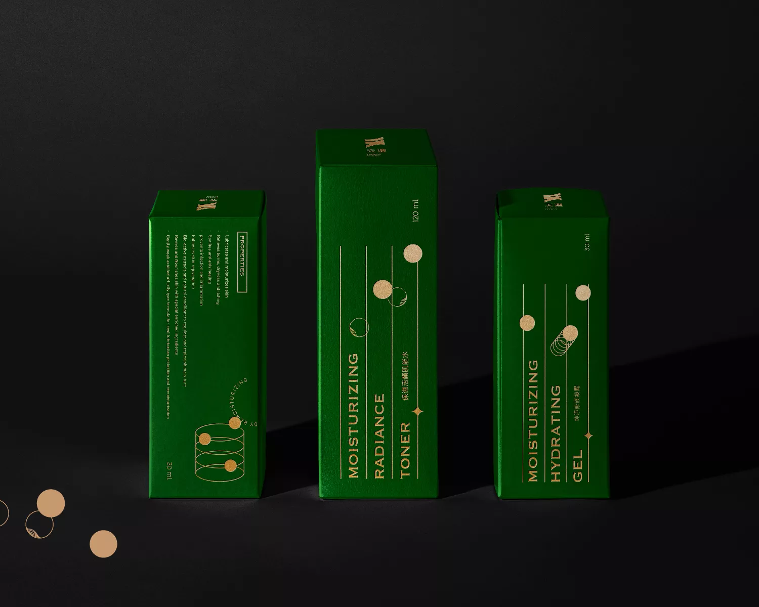
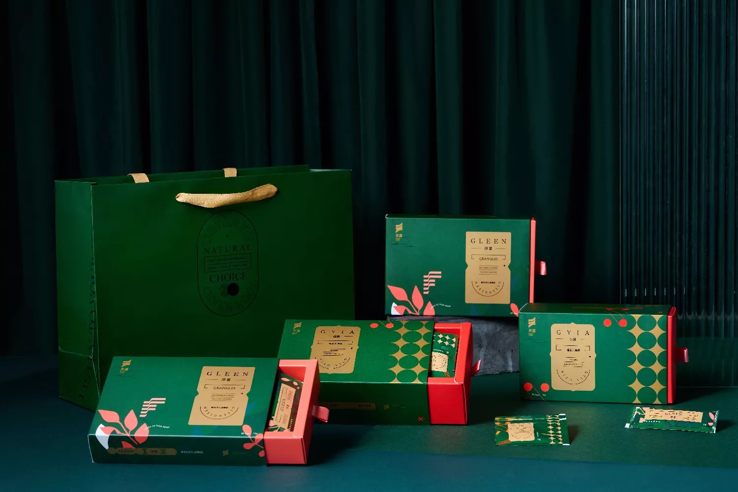
包裝設計依照商品不同的功效,賦予不同的元素在其中。元氣飲採用圓點元素搭配鮮豔色彩,展現生動的意象。維持消化機能產品則運用線條製造腸道之意象。保養品系列則採用多元的圓形輔助圖型來代表臉之意象以及使用產品前後臉部之變化。
From skincare to overall health maintenance, Natural Choice offers you the most natural and purest health solutions. We use sea buckthorn as the main ingredient in our products. Sea buckthorn thrives in extremely harsh environments and is a highly valuable plant with excellent nutritional benefits. Its berries are easily absorbed and provide nourishment and strength to the body. In recent years, sea buckthorn has gained worldwide attention and is recognized as a potential medicinal and health-promoting plant.
The use of natural ingredients sets our products apart from other health supplements. They can be taken internally or applied externally. These types of fruits are not easily obtained, but our sole intention is to accompany you on your journey to restore your health.Our skincare series contains a variety of precious ingredients such as sea buckthorn and aloe vera, providing moisturizing, radiant, and firming effects for the skin. They help maintain the skin’s optimal performance and provide the best repair and restoration.For your personal daily joy and health.
The logo design combines the Chinese character “天” with the imagery of jumping, presenting a healthy and lively image. The main color used is green, reflecting the brand’s natural ingredients, with gold as a supplementary color to convey a sense of exquisite packaging.The packaging design incorporates different elements according to the products’ various functions. For the vitality drink, it uses circular elements and vibrant colors to create a lively image. The digestive support product uses lines to represent the imagery of the intestines. The skincare series utilizes diverse circular graphics to represent the image of the face and show the changes before and after using the product.
