橙夏
Juice Bar
- 手搖飲連鎖品牌識別系統設計丨攝影企劃丨品牌應用設計
想像置身陽光灑落的果樹旁,伸手摘下一顆新鮮柳橙,完整搾萃一杯濃濃果香的酸甜橙汁。
這是「橙夏」期許每一杯手作鮮果汁給人的味覺感受,嚐遍台灣各產地和進口水果,數百萬杯鮮打果汁的手作經驗,專注於橙類水果的旋打和鮮榨技術,長達六年的時間,淬煉出「橙夏」的鮮搾技術及對風味的敏銳度。
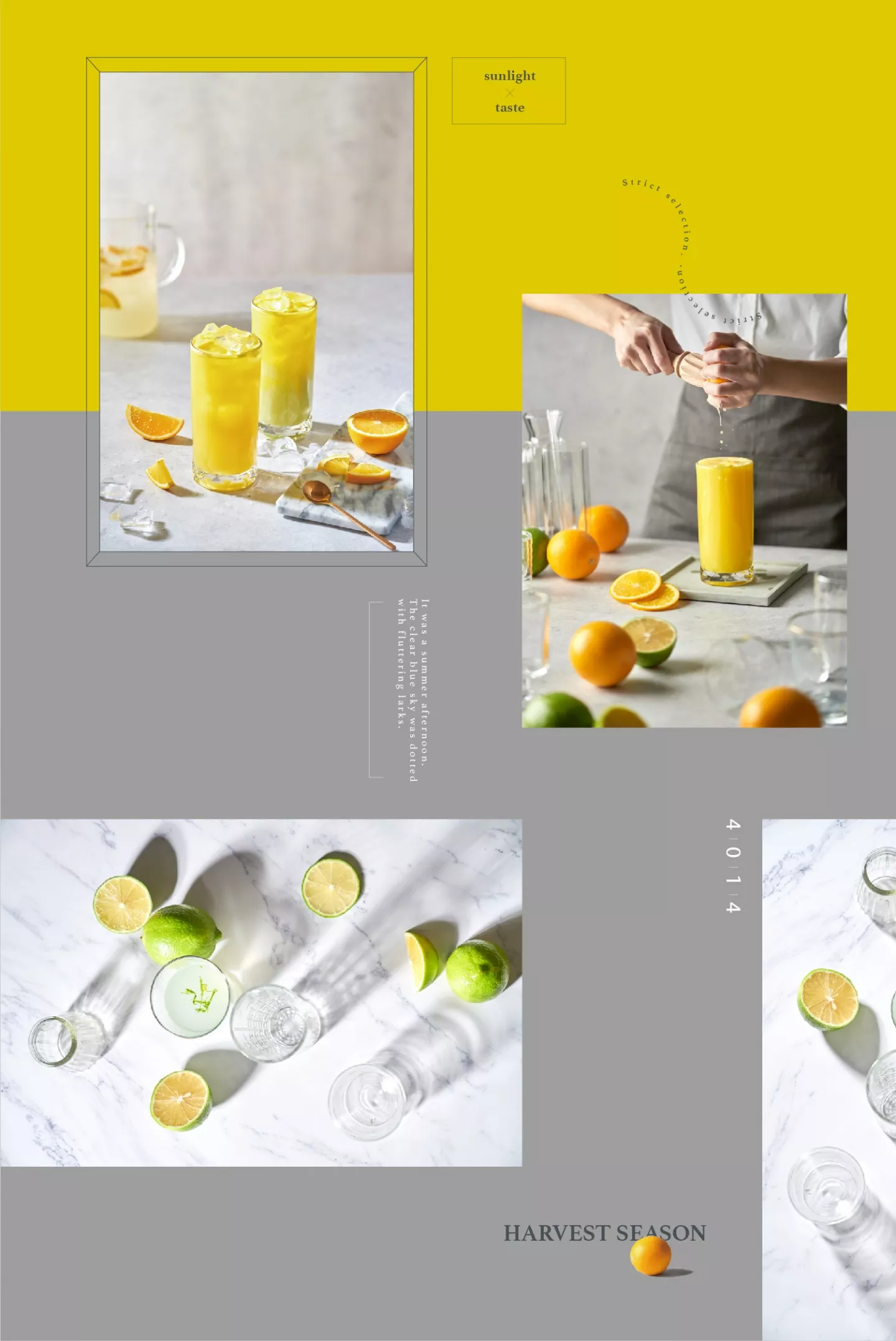
品牌整體視覺的發展主軸,期望以新鮮柳橙的特色為基底,賦予品牌陽光燦爛的鮮明個性。春夏時節,讓人期待來點新鮮的清新印象,進入秋冬,又讓人感受到陽光、充滿朝氣,而非一聯想到喝杯鮮果汁就感到冰冷。
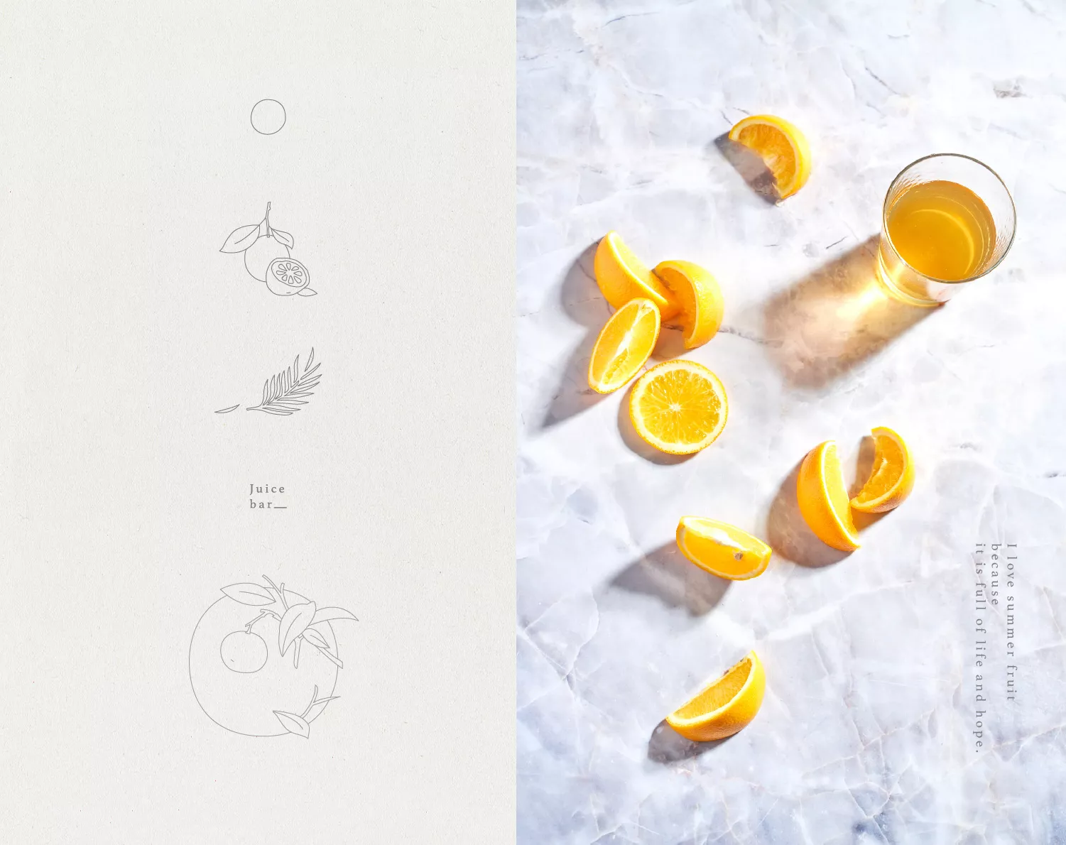
識別的構思,蘊含了一顆鮮橙及在乎自然新鮮的意象,字體設計則以人文調性為基礎,營造專業不失穩重,卻仍保有細部特色的設計表現,詮釋品牌定位於
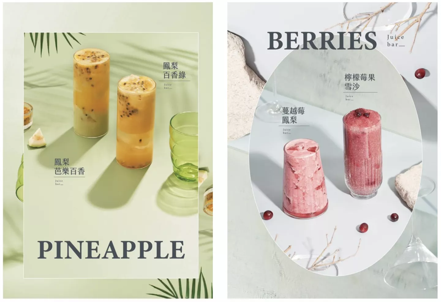
鮮橙果汁職人的專業形象。現代線條感、微寫實手法的輔助圖形,融合大面積澄黃色作為品牌標準色,期望將「鮮橙」的形象特徵極大化,從中連結「橙夏」長久專注於橙類鮮打果飲的職人精神和調飲實力。
Imagine standing next to a fruit tree under the sun, reaching for a fresh orange and squeezing it into a glass of tangy sweet and sour orange juice.
This is the vision of the brand “Juice Bar”, that every glass of hand-made fresh fruit juice would give the customer that very sensation. Built on six years of squeezing millions of cups of fresh orange juice and having savored all sorts of fruits from local to imported, the brand “Juice Bar” has refined the processes of stirring and squeezing fruit juice to extract the most delicate flavors.
The brand’s design hopes to incorporate characteristics of fresh oranges as its main focus, emphasizing the brand’s bright and shinning personality. During the summer and spring, it brings a new and fresh perspective, while in the winter, it brings to memory the warmth of the sun, full of vitality, even when the drink is a cold cup of orange juice.
The brand is built on the concept of the freshness of oranges and the concern for the organic. The font design uses a more classical style,professional, yet still retaining the details within the design, positioning the brand as a skilled artisan in the area of fresh orange juice.
The auxiliary graphics combine a modern use of contour lines creating a more realistic look and in tandem with large yellow color blocks as the brand color, together, the design hopes to amplify the image of “freshness” and ultimately put on display the expertise and vigor of each employee of “Juice Bar”.


