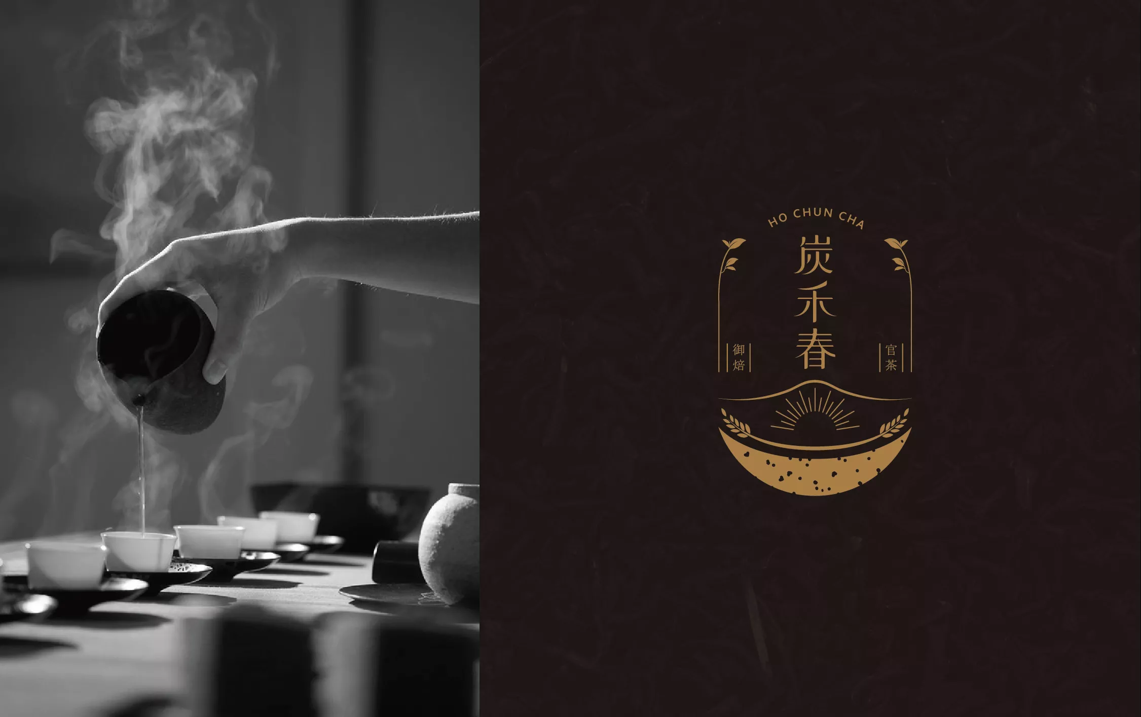
炭禾春
Ho Chun Tea
- 炭培茶品牌識別系統設計丨茶葉禮盒設計丨應用設計
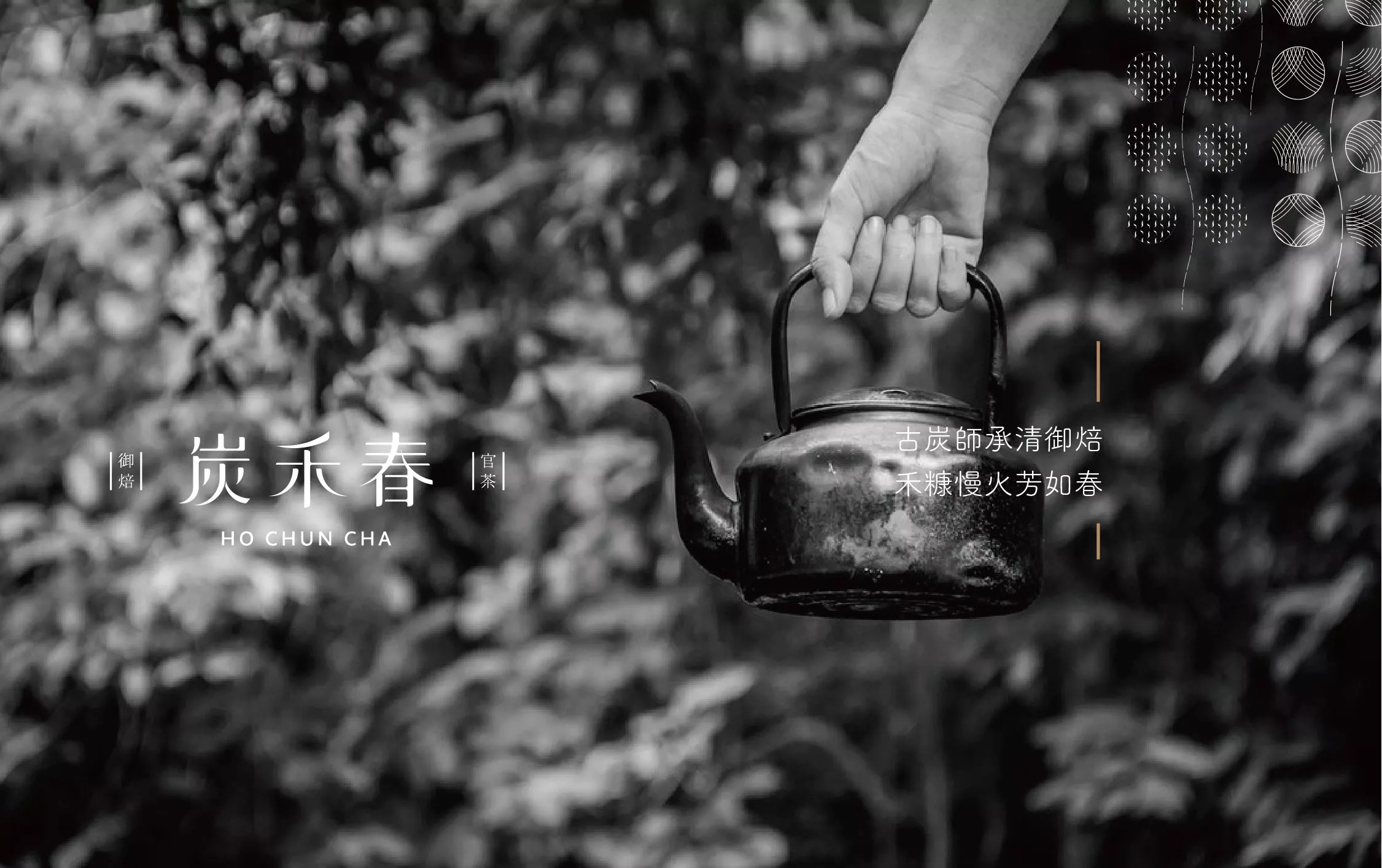
正宗的古法炭焙茶,能透過焙火依循不同茶種,火侯焙度轉化出深度不同、香氣厚度不同的獨特茶香,讓人越是細飲,越是著迷其可清新、可深邃耐人尋味的茶香。台灣第一代木炭官焙茶始於清末四十位官方焙茶師來台,炭禾春是清末民初一脈傳承至今第三代官方御焙功夫,在深入瞭解焙茶功夫後,讓人深深讚嘆其極為耗時、挑選台灣龍眼木炭、稻米糠,鑿以陰陽灶慢焙,長達十五天不眠不休的工序。每一口無法複製的好茶的背後,仰賴的不僅是費時費力,晝夜時刻的翻茶、照顧,判斷每一季收成茶種,合適溫度與火侯變化的精準度,還有老師傅數十年歲月累積,極敏銳的視覺和味覺辨察。
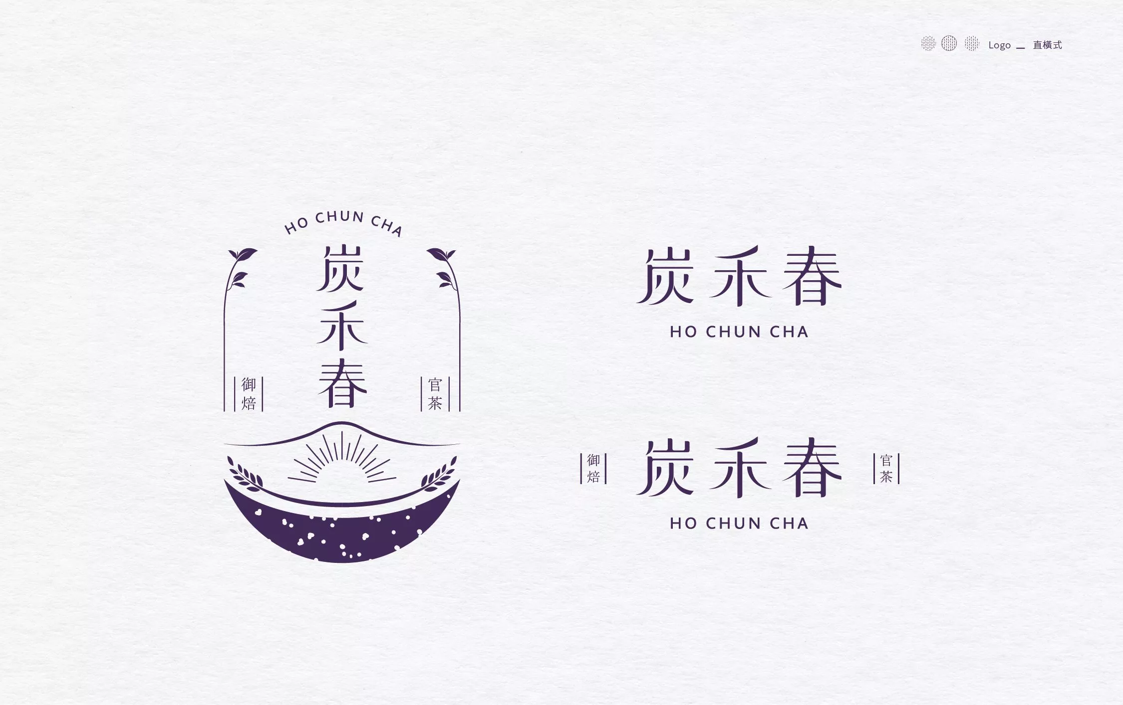
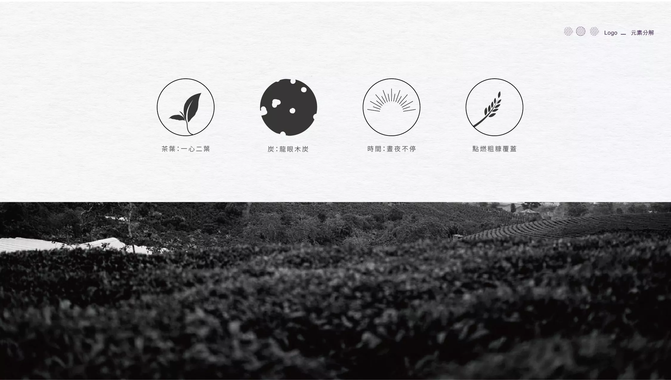
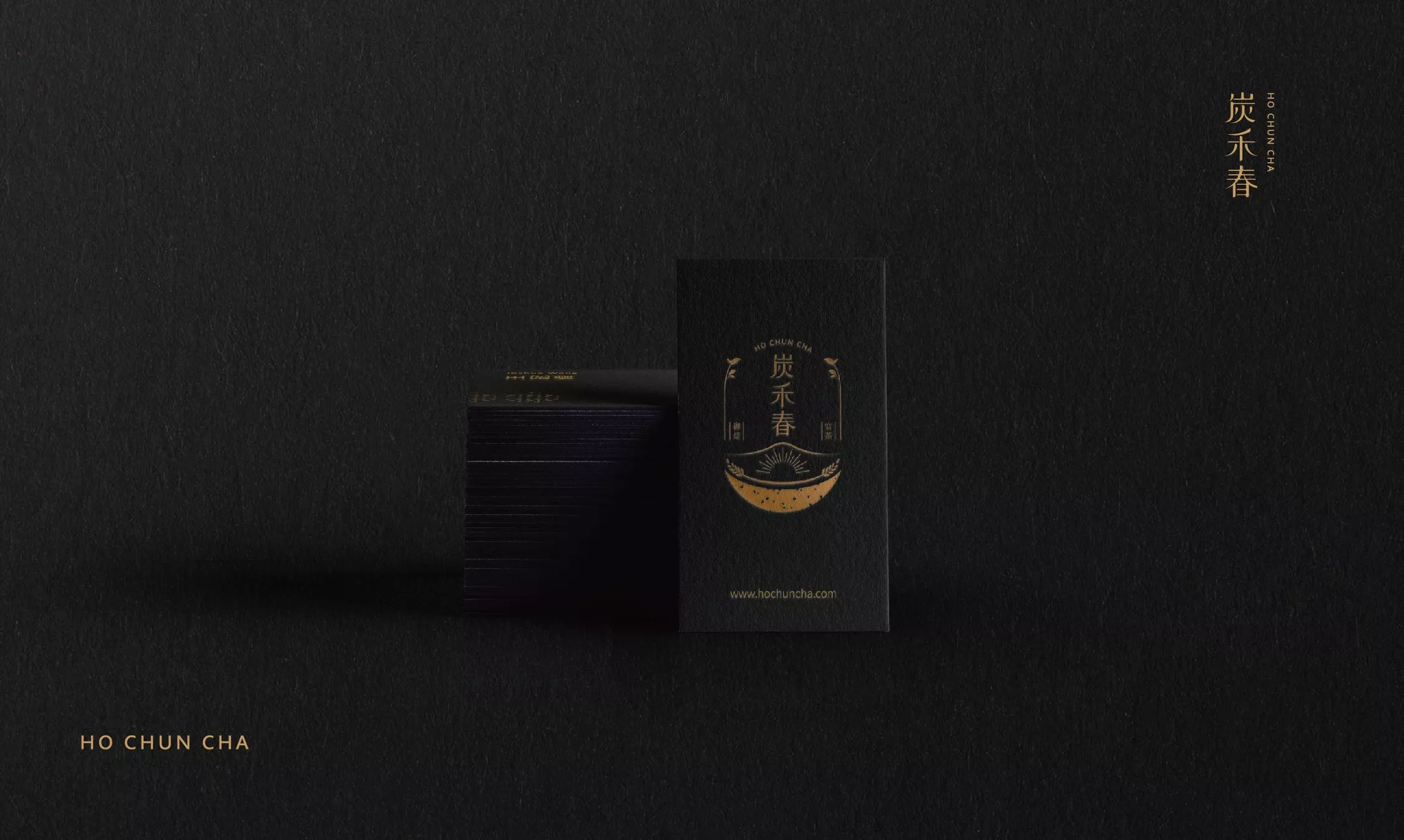
品牌識別的發想來自炭禾春珍貴獨有的品牌力,以山間焙茶為根基,將品牌根本精髓———官焙茶之功夫,融入傳遞的意象之中,烘托出品牌故事性及深厚底蘊,透過轉化龍眼木炭擊碎的設計語彙,象徵粗糠的稻禾意象,以及正宗官焙最重要也最難以複製的「溫度」拿捏,歷經時間的考驗,日夜堅持不懈,烘製出最純粹道地的焙茶的精神,完整構成了品牌主識別設計。
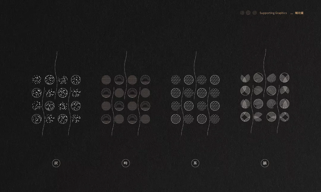
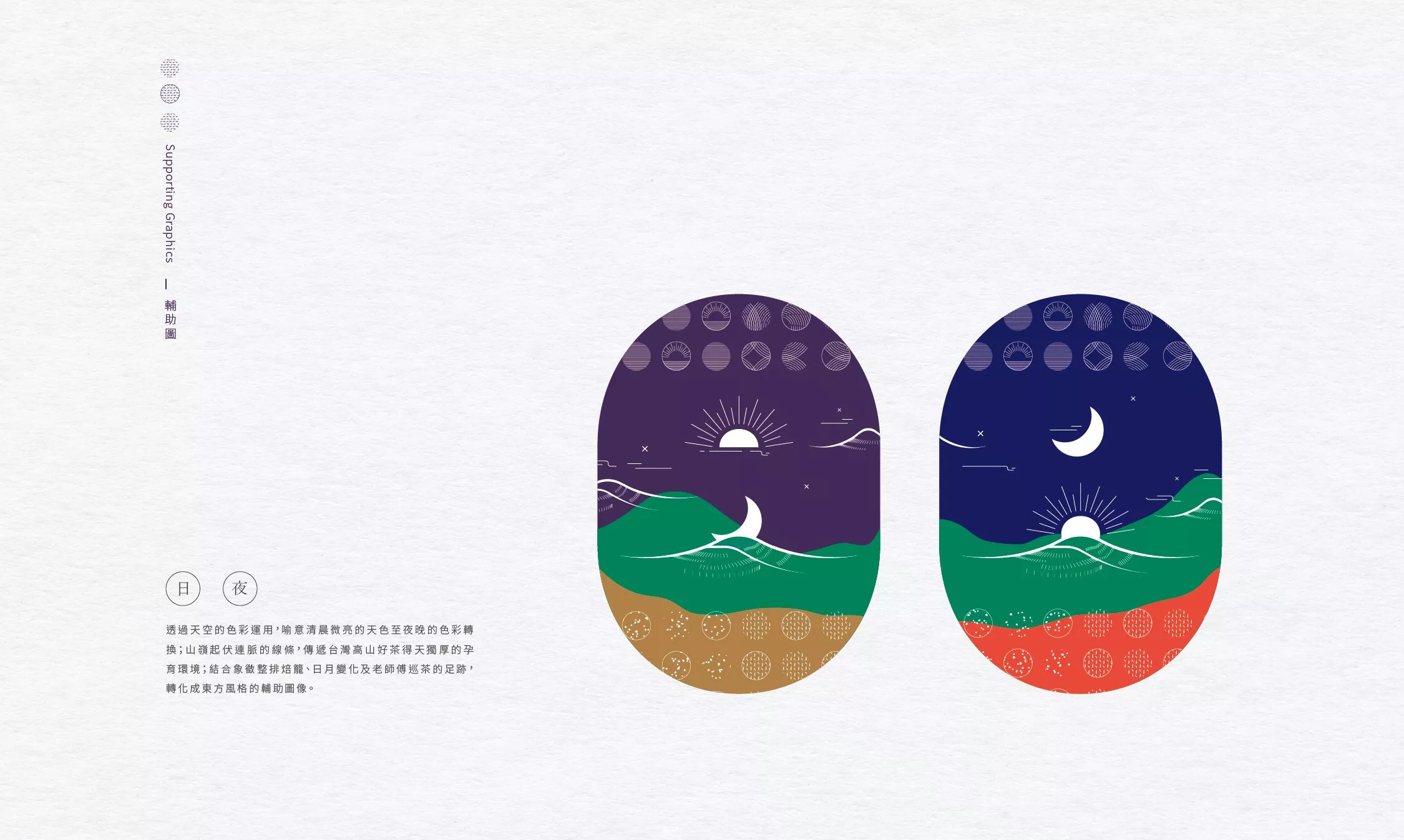
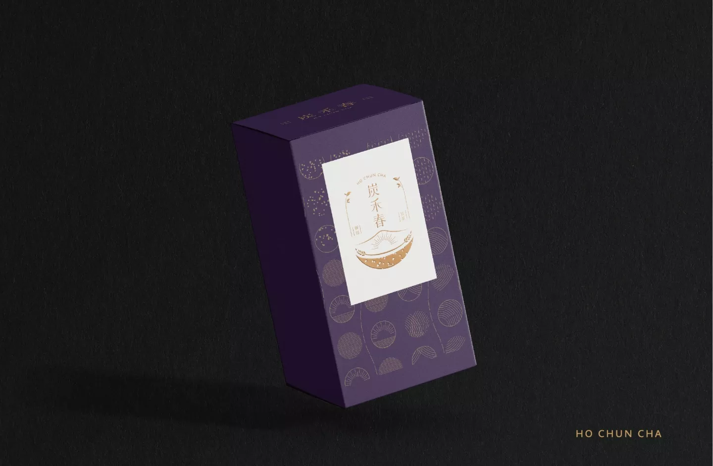
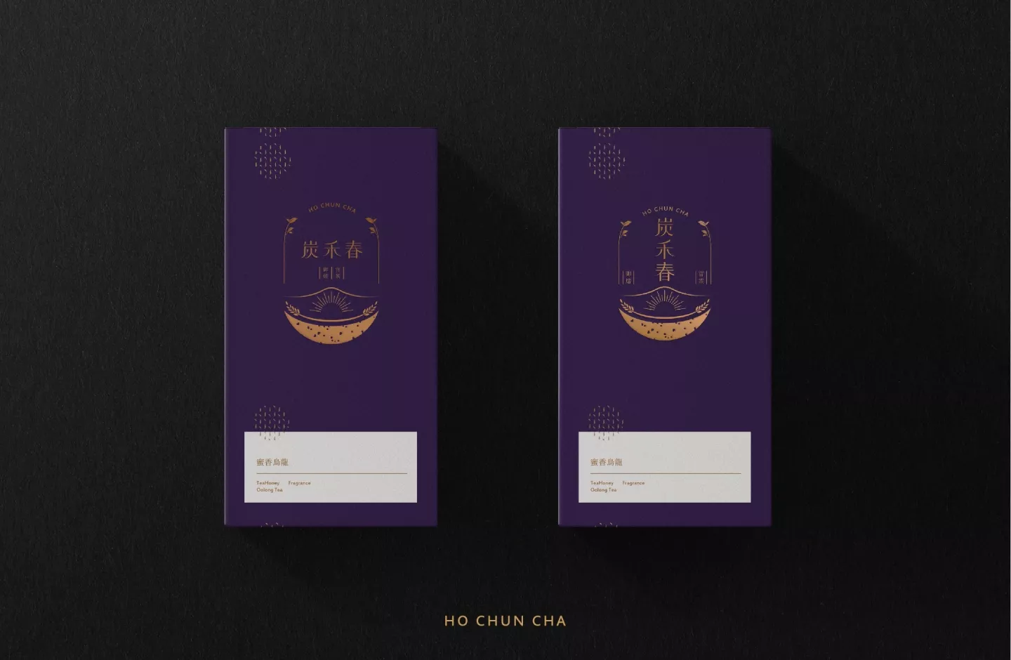
字型線條的構思特別轉化了「茶葉葉形」與「木炭形體」的意象做為字體設計的架構,注入洽好的比例與律動,平衡視覺,營造出炭禾春獨有專業又不失歷史人文氣息的職人精神,為品牌劃下專屬的印象。而色彩的應用以尊貴的藍紫色呼應「官焙」的獨特價值,輔助圖形則透過天空的色彩運用,喻意清晨微亮的天色至夜晚的色彩轉換;山嶺起伏連脈的線條,傳遞台灣高山好茶得天獨厚的孕育環境;結合象徵整排焙籠、日月變化及老師傅巡茶的足跡,轉化成東方風格的輔助圖像,在未來品牌的視覺發展上不只烘托炭禾春獨厚的品牌價值,更可達到靈活延展的視覺應用。
The authentic ancient charcoal roasted tea can produce a unique type of tea through the art of roasting. Fire roasting creates a unique tea fragrance of a completely different depth of aroma. With every drop of tea, fascination of its freshness and profoundness overtake you. The first generation of charcoal roasted tea in Taiwan began in the late Qing Dynasty with 40 official tea roasters coming to Taiwan. Ho Chun Tea is a legacy of three generations of roasting mastery passed down since the Qing Dynasty. An inspiring awe overtakes you as you come to understand the extremely time-consuming process of roasted tea, starting from the selection of Longan charcoal and rice to its slow roasting, taking up 15 days of non-stop hard work.
Behind every sip of tea are countless hours of hard work day and night, turning of the tea leaves, caring of the fields, timing the harvest, gauging the roasting temperature, and decades of mastery, fine-tuning the senses to become extremely acute and sharp.
The brand recognition is built on Ho Chun Tea’s strong tradition of roasting tea and its mastery, which is at the core of its brand. The design combines the image of the crushed Longan charcoal, the chaff from rice paddies, and the symbol of the sun to symbolize the most important element, yet most difficult component of the process: “temperature”. These visuals represent the arduous process of roasting, non-stop day and night diligence to create the most authentic roasted tea. Together, these elements create the legacy and the profound story behind the brand.
The vectors of the font design combine the concepts of “tea leaf contour” and “charcoal silhouette”, merging both proportion and rhythm to create a balanced visual and conveying the brand’s professionalism without losing its legacy and history.
The application of the royal purple color echo the unique value of “roasting” with the auxiliary graphics use the colors of the sky to bring out the bright of the morning to the colors of the night. The undulating lines resemble the mountain which are home to this amazing tea. The symbolic imagery of rows of roasting baskets, the changes from sun to moon, and the craftsmanship of the master all conjoin to create the auxiliary image reflecting a more oriental style. In the future, the visual development will not only highlight the unique value of Ho Chun Tea’s original brand but create an extension of various flexible visual applications.
