日生堂
Niseido
- Behance精選
- 日本保健品品牌識別系統設計|包裝設計|攝影企劃
日本保健食品「日生堂」,識別設計以名稱「日」及「N」結合而成,蘊含中文「日生堂」與英文「NISEIDO」兩者字首,以正面視覺與轉向後的角度變化,使logo呈現兩種不同面向;字體方正搭配筆觸微上揚的尖角設計,強化品牌識別度之於,也以沈穩深藍色及溫暖金色相互搭配,亦能提升品牌為專業穩重的保健食品領域。
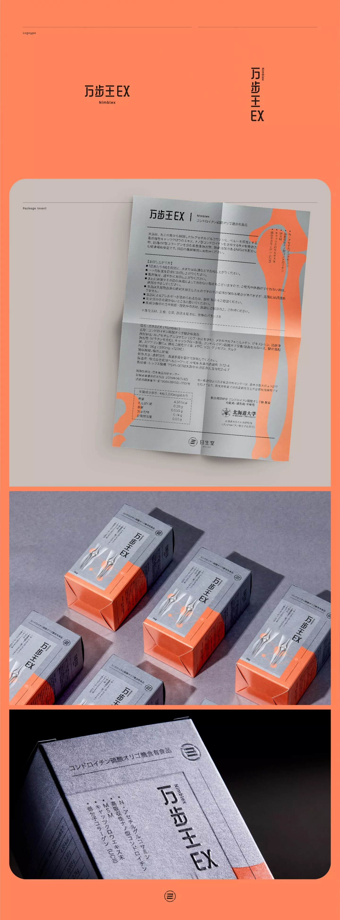
|万步王|前端發想階段,以期盼保健食品能帶給人們營養補給、強健骨骼為根基,提供人體健康所需,使保健食品漸進式融入日常生活,因此制定包裝設計方向,以治癒為導向,從顏色劃分兩大區塊,銀灰色代表身體骨骼,橘色色塊象徵食用保健食品後,骨骼治癒的成果。
|納豆の力|在日本被譽為解酒聖品的納豆,因有預防及調解脂肪肝、降血脂血管等多重功效,被廣泛的運用到保健食品中。包裝設計,將納豆外型以不同大小色塊在包裝上呈現,一如真實的食品般,運用幾何線條,將一顆顆納豆相互黏稠的樣貌加以連結,傳遞產品特性。
兩包裝在後加工部份,將Logo、產品名、納豆圖案,以打凸打凹方式刻畫,增加包裝的質感細節度,從視覺呼應高級保健食品的品牌形象,帶出產品特性,給人安心、自然的食用印象,提升品牌與產品的相互連結性。
The concept design of the Japanese health supplement brand “Niseido” uses a combination of the character “日” and letter “N”. It contains the first character of the Chinese brand name “日生堂”and the first letter of the English brand name. The logo is designed so it displays one character in one direction and another when angled, thus presenting the logo in two facets. The use of a square font with curved sharp edges helps give a more distinct look and with a combination of calm dark blue and warm gold, together they enhance the product’s image as a professional and reliable health supplement brand.
|Nimblex|In the early stages of the design, we hoped to emphasize how health supplements can replenish the body’s missing nutrition and strengthen bone composition. For that reason, the design concept focuses on those benefits and how they can improve heath and healing, using two major color schemes: silver gray, representing the bones in the body and orange, representing the healing resulting from the intake of health supplements.
|Natto Power EX|Natto, known as the holy grail in treating hangovers in Japan, is widely used in health foods because of its many benefits such as preventing and regulating fatty liver disease and lowering blood lipids. In the packaging design, natto is represented using various sizes of color blocks while connecting them with geometric lines representing the viscosity of natto, overall highlighting the features of the product.
In the post-processing of both packaging designs, the logo, product name, and natto patterns are portrayed using embossing to enhance the texture design, further accentuating the brand as a high-end health supplement product. The design hopes to highlight the product’s strengths, giving the consumer a peace of mind and enhancing the connection between brand and product.


