旺福
Wonder Life
- 中式茶館品牌識別系統設計 | 品牌應用設計
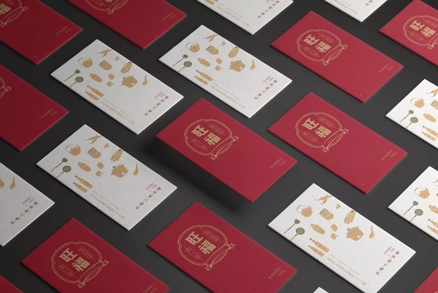
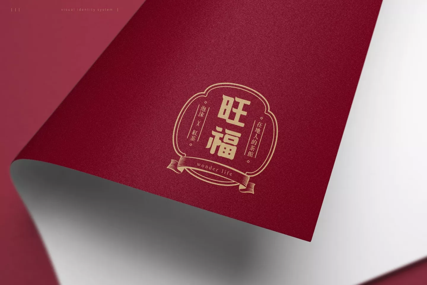
「旺福」以在地人的茶館wonder life作為品牌識別口號,搭配復古熱情的深紅色,字型設計以渾圓大器的字體結構,橫劃左上角揚起的斜角象徵火(旺)的意象,圓融的福字象徵飽滿豐收。
整體logo外框結合台灣早期每戶人家門外的傳統窗花意象,並加入復古感旗幟,象徵著旺福所傳達出的懷舊感與家的氛圍。
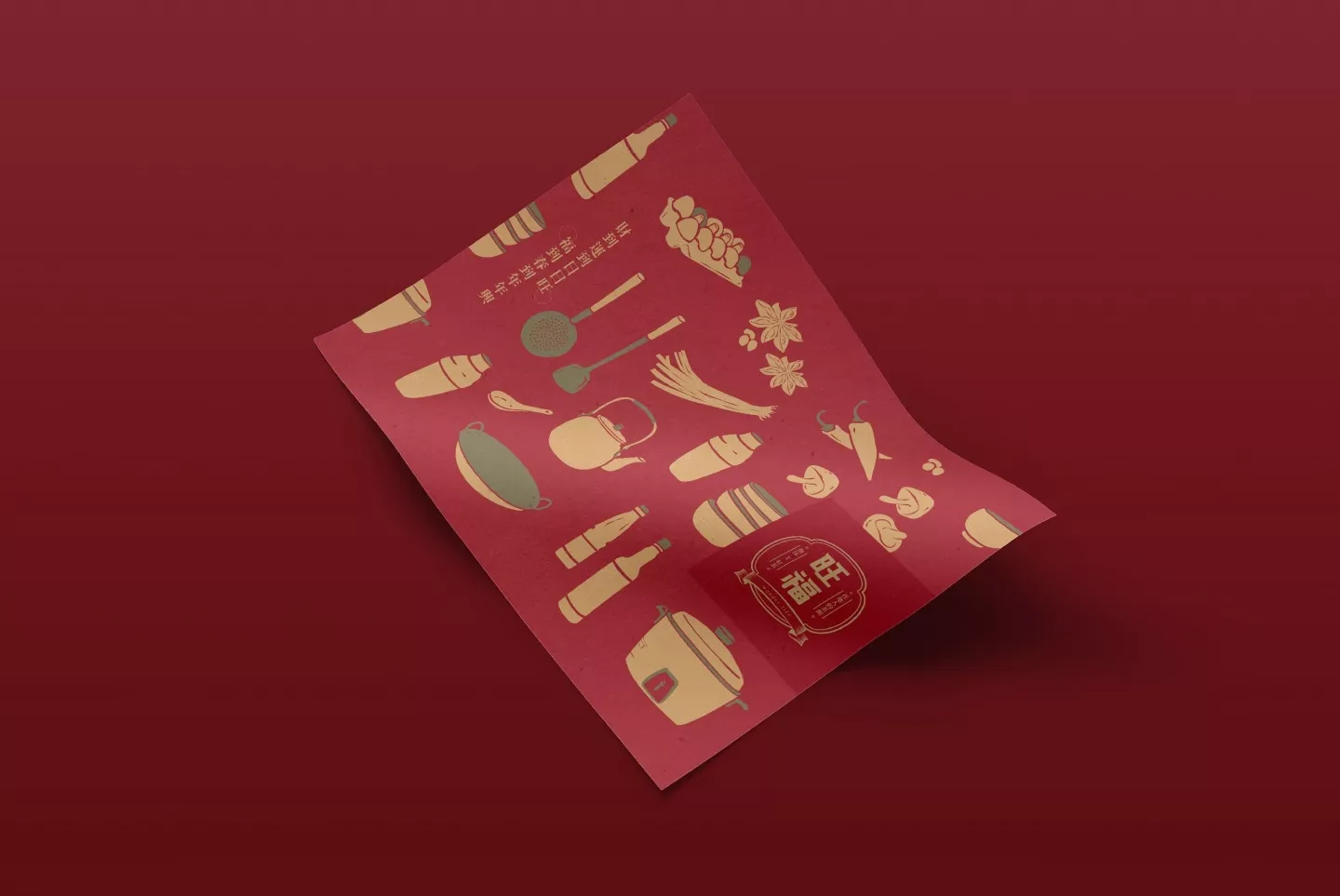
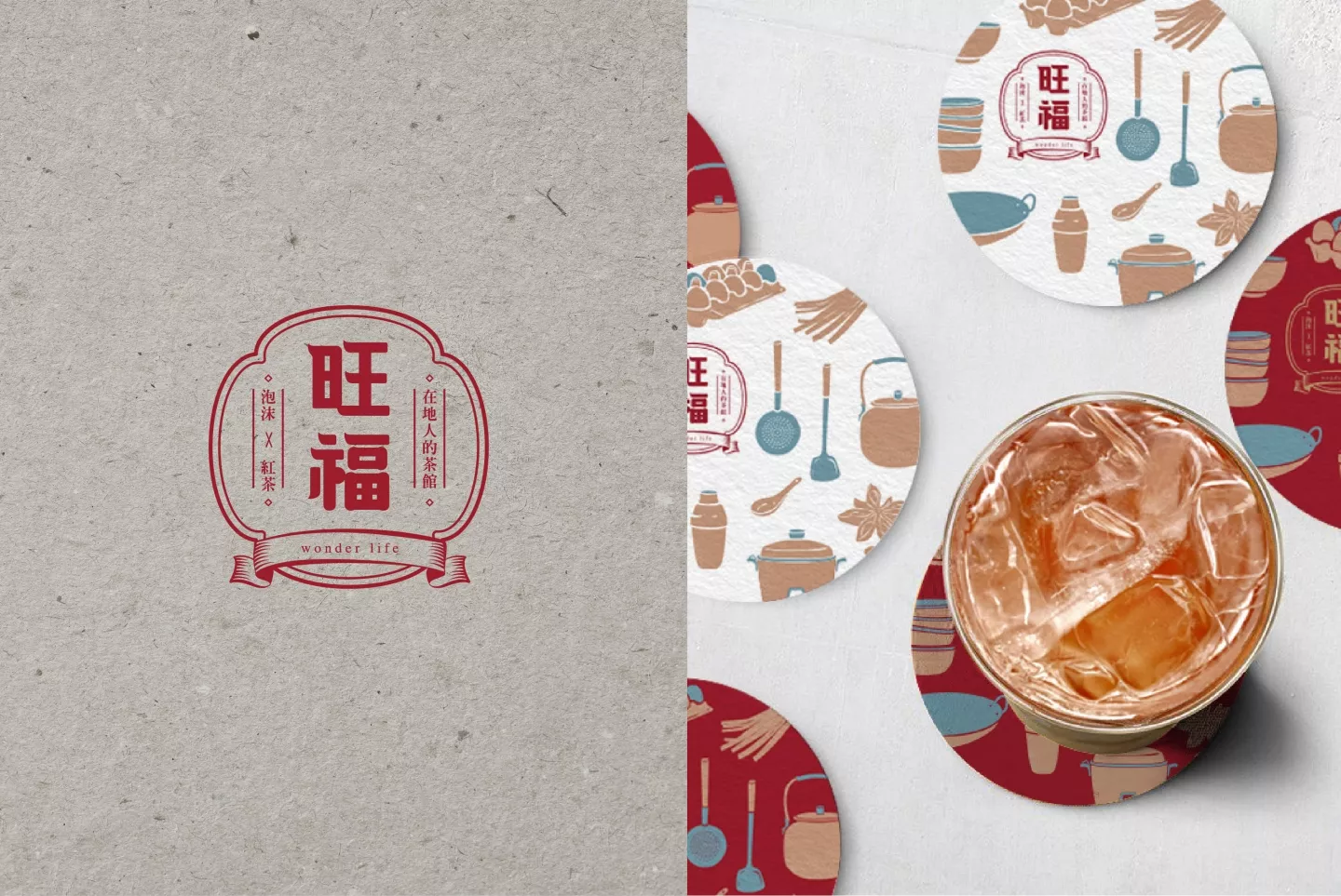
輔助圖形配色來自於家的溫暖滋味與五零年代的美好記憶,以絹印的質感呈現古早味插畫,傳達出家的溫暖及台灣早期懷舊的感覺。
有多久沒有好好的坐下來品嚐一杯濃郁香甜的純粹好茶了呢?
一壺沉香好茶、一份精緻餐點,勾起人們心裡最底層的好滋味,品牌融合復古50年代及在地家鄉人情味,品嚐美食之餘享生活佐茶時光。
The “Wonder Life” tea house uses the phrase “wonder life” as its slogan in combination with an old-fashioned dark red as its color scheme. The font design is built mainly on large round contour shapes. On the Chinese letter “旺” the upper left edge slightly curves up as if on fire, while the fullness of the Chinese letter “福“ represents blessed harvest.
The overall logo frame combines the traditional window imagery of each household in Taiwan’s early days, and adds an antique-style banner, symbolizing the nostalgia and feeling of home conveyed in Wonder Life.
The matching auxiliary graphics focus on the warm sensation of home and the memories of the 50s, including the use of old-fashioned traditional cuisine into the illustrations, to convey the warmth of family and a sense of nostalgia of early Taiwan.
When was the last time you sat down to taste a cup of rich pure tea? A pot of rich quality tea with a fine meal evoke the best from the bottom of people’s hearts. The brand blends elements of the 1950s, restoring the taste of home, and renewing a moment to enjoy the food and tea.