豐食祭
Fong Shi Ji
- 菜頭粿品牌識別系統設計|品牌重塑 | 包裝設計 |攝影企劃
菜頭粿,對於台灣傳統記憶來說是過新年時,阿嬤灶腳飄香的年味,也是特定節日祭祀時,餐桌上才會出現的道地風味。「豐食祭」以豐衣足食的精神,連結台灣傳統生活文化的記憶,選用台灣產地直送的白蘿蔔,純米成分,堅持手作,延續古早蘿蔔糕的精髓,每一口都吃得到真材實料的蘿蔔香和米香。
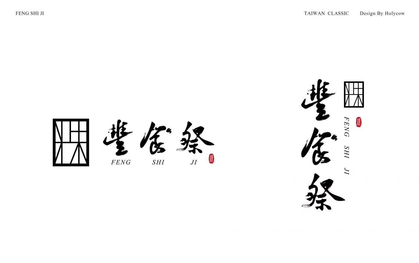
長久以來「豐食祭」一步一腳印在全台灣傳統菜市場一攤攤叫賣販售,逐漸在市場界建立起口碑,甚至將「專注做好每一塊蘿蔔糕」作為一生重要的志業。這次希望透過品牌整體識別的重新建立,優化整體視覺印象,同時拓展行銷市場。在品牌主識別設計上,透過蘿蔔粿剛出爐切塊的切割線條,轉化成「粿」字的意象,圖象又兼具字義的手法,增強人們的視覺記憶,象徵手作也傳遞出類東方花窗的風格,呼應台灣傳統粿食的文化氣息。
標準字則以傳統書法字表現手感和古早味的氣息,希望傳遞穩重、真樸、專業卻不刻板的印象,標準色則以金色、磚紅色、米色、黑色為主,象徵新鮮食材的本質、年節、火侯、專注的職人精神,烘托出台灣傳統蘿蔔粿的溫度,同時兼具中高端品牌的質感和細膩度,同時我們也為品牌企畫一系列的形象攝影,強化「豐食祭」品牌核心作粿職人的嚴謹態度,透過最家常的料理方式,希望將創始人對蘿蔔糕用心究極的精神,及這份堅持道地實在的無比美味讓更多人看見。
在這裡,不會再有使你揮之不去的恐懼,每個角落,都有溫暖,都有親切。我們只想讓你擁有健康亮白的牙齒,重拾一份自信的微笑。 整體設計採用自然色系配色,活潑又有溫度的呈現。圖騰採用牙齒的意象,直覺性的反應店家本質,搭配色彩展現出親切的氛圍。英文字體選用襯線字,加強專業及穩重的概念。整體視覺以圓形為主,代表病人與醫療體系間的良好互動,圓滑且親切。
The white radish cake represents a unique memory in traditional Chinese culture: both during Chinese New Year with the fragrance from the stove as grandma is preparing the food overwhelms the room, as well as being a key local dish during important festivals, especially when paying respect to the ancestors.
Inspired by the concept of abundance, ” Fong Shi Ji” conjoins the memories of Taiwanese traditional culture. Choosing amongst the local produced radish cakes, hand-made out of pure rice, to preserve the essence of traditional radish cake cuisine. With each and every bite you can taste the purity in the ingredients and the fragrance of the rice in the radish cake.
Since long ago, “Fong Shi Ji” has been selling in the traditional Taiwanese markets, gradually establishing a reputation, making their motto of “making every radish cake perfect” the center of their business. This time around, we hope to re-establish the overall brand recognition by optimizing the overall visual impression and expand beyond the current market.
In terms of brand recognition, the logo uses the concept of freshly cut-lines of the radish cake to cut out the lines resembling the Chinese character “粿” (Rice Cake). Thus, enhancing the viewer’s visual memory, while at the same time conveying the values of being a hand-made product with a combination of the latticed window design to fully echo the Taiwanese traditional rice cake cuisine culture.
The font uses traditional Chinese calligraphy to express the serenity, simplicity and professionality of this traditional cuisine, yet showing that it is not old-fashioned. The main color scheme utilizes gold, brick red, beige and black symbolizing the essence of the fresh ingredients, the annual festivities, the culinary flame, and the dedicated staff. Together, the colors draw out the warmth of Taiwan’s traditional radish cakes and at the same time display the detail and sophistication of high-end brands.
We have also planned for a series of photoshoots to strengthen the “Feng Shi Ji” core brand’s commitment to precision in the creation of the cuisine. Furthermore, through the display of home-cooking methods convey the founder’s profound devotion to radish cakes, so that all can experience the authenticity and delicacy of the brand.